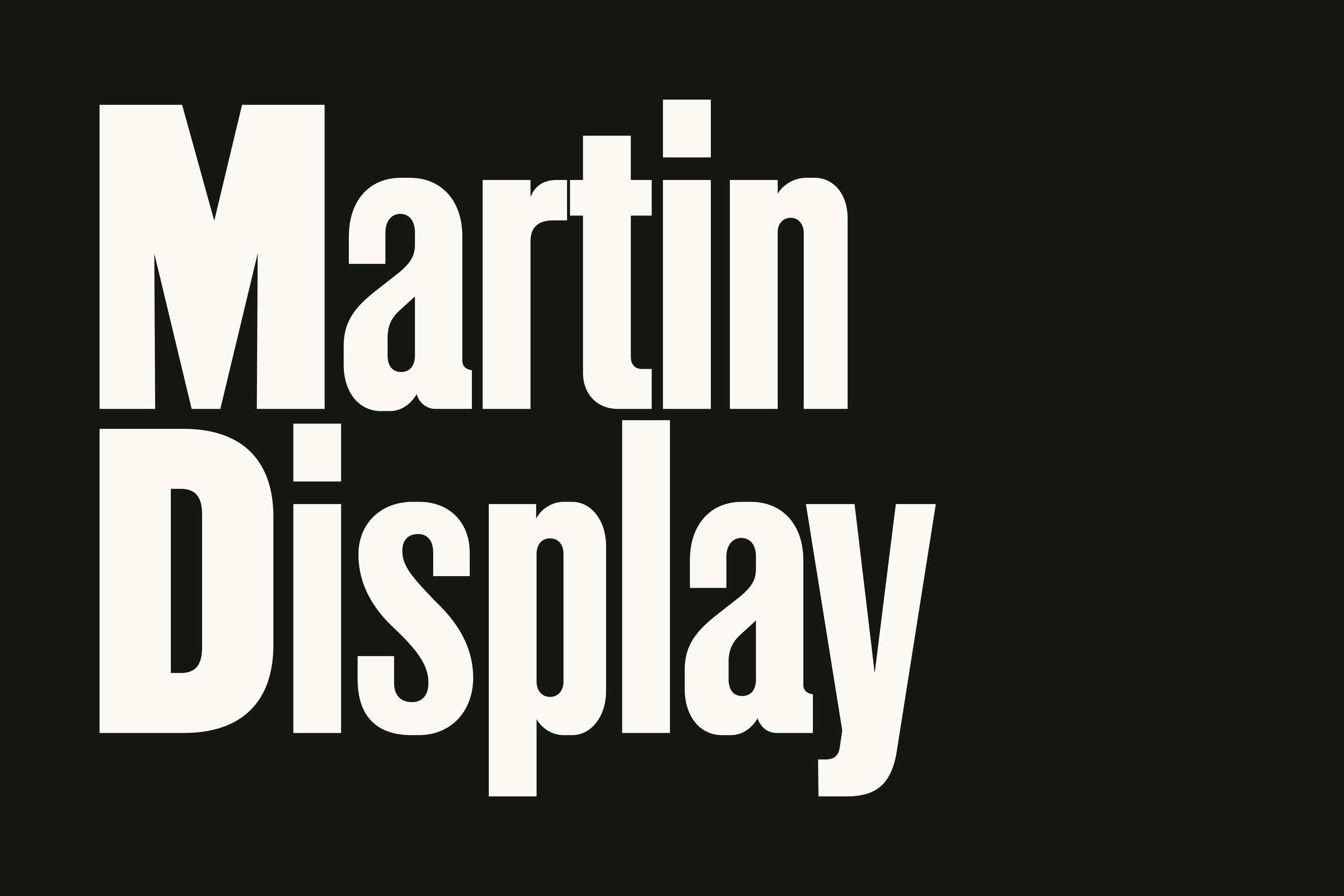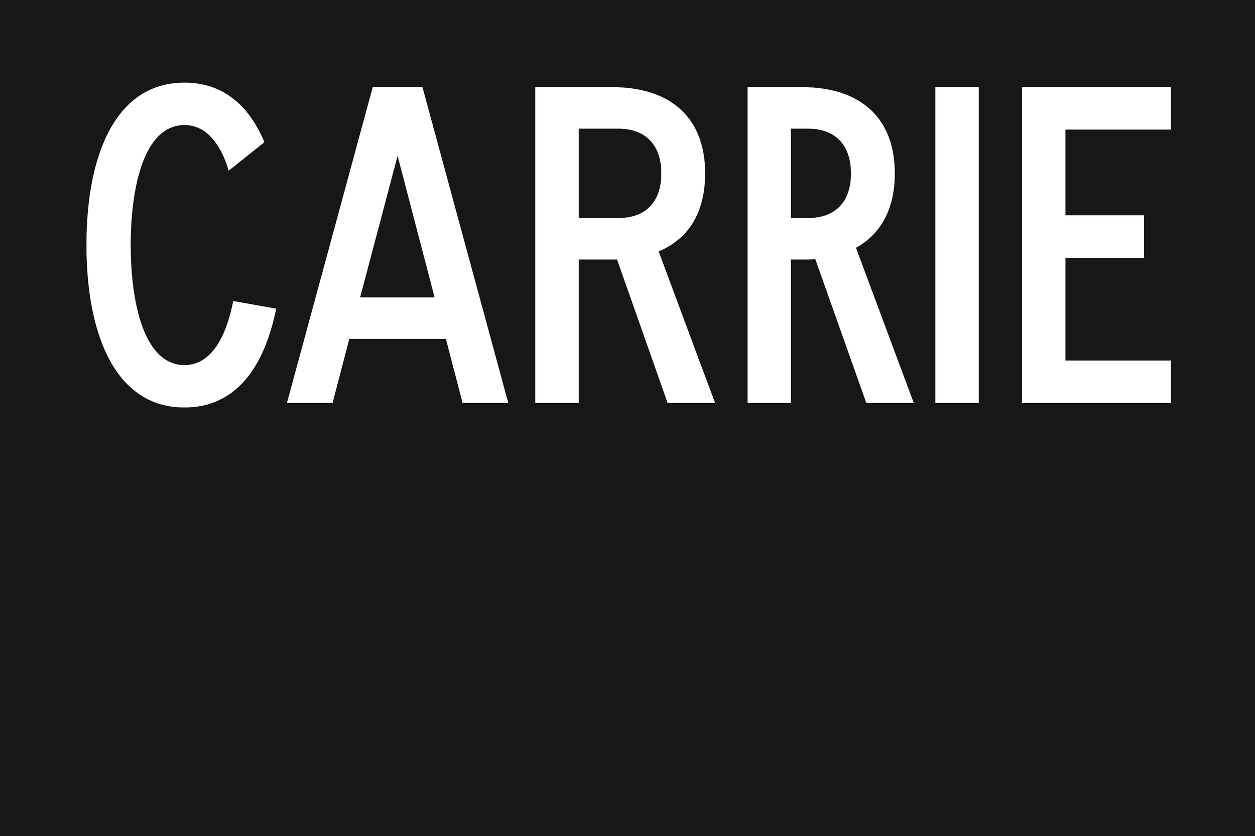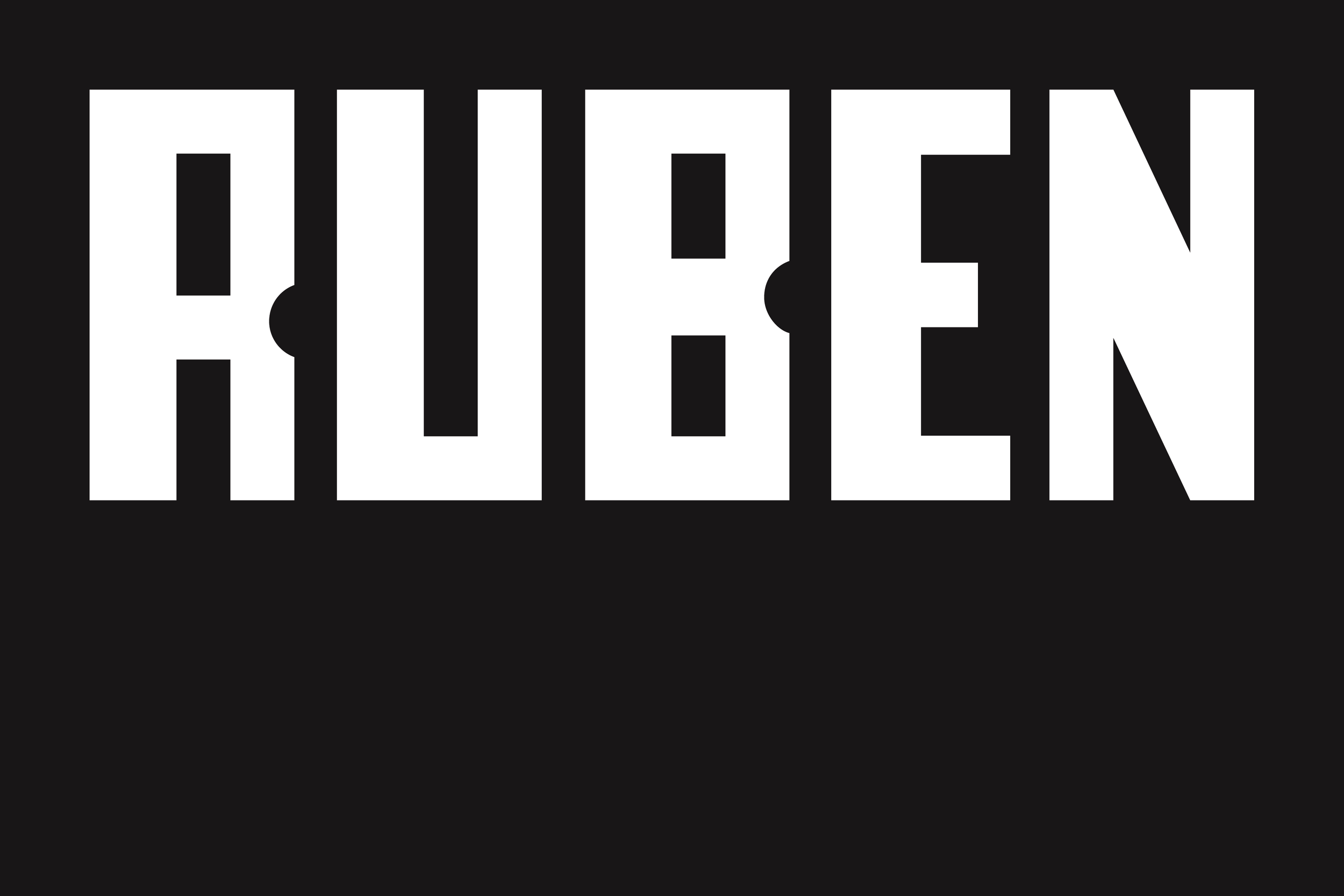
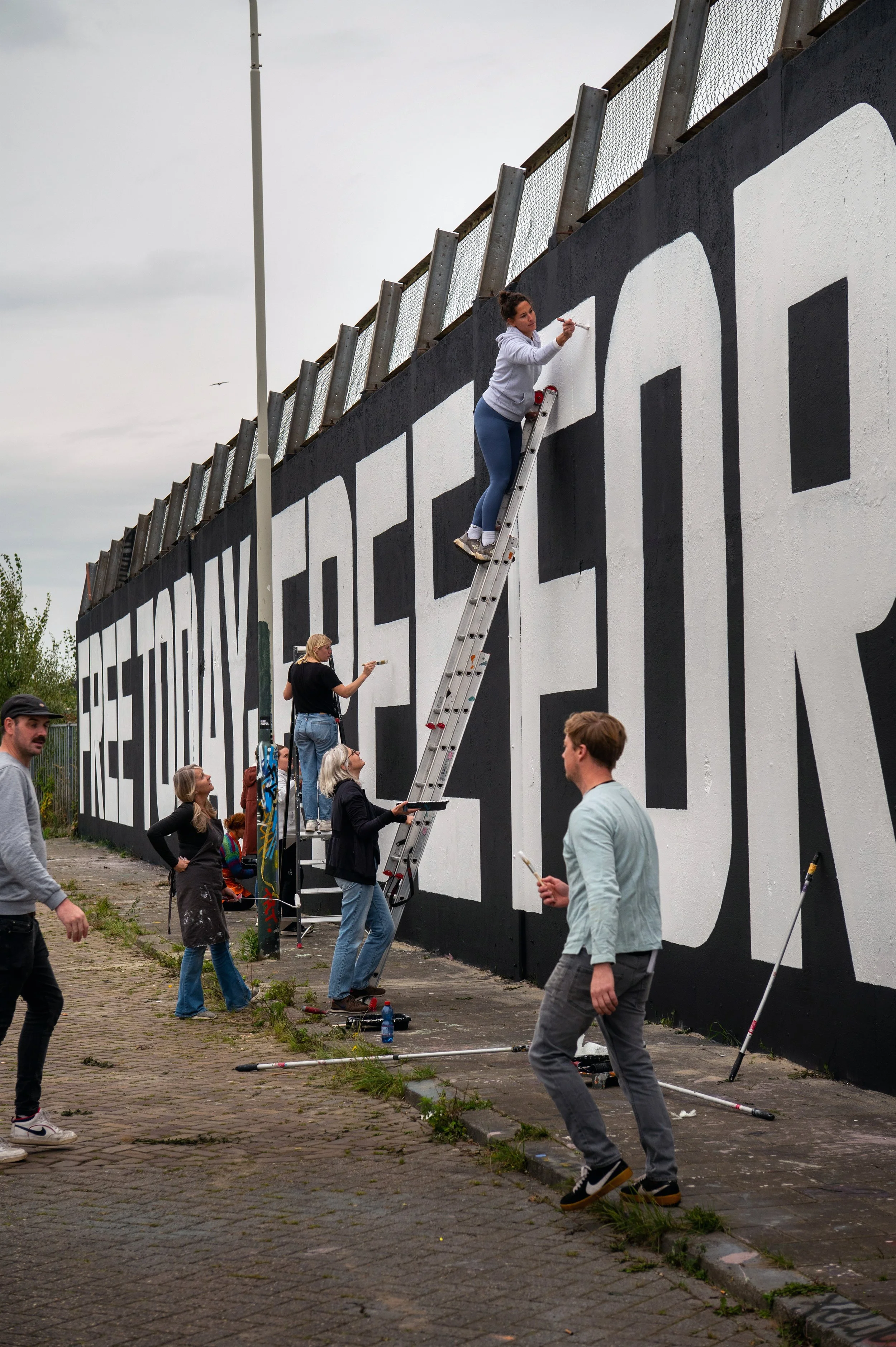
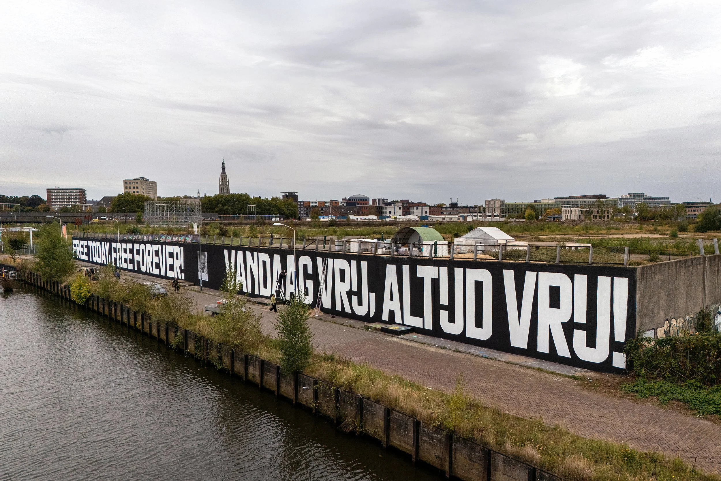
In October 2025, Graphic Matters, a Breda-based design organization focused on the social and civic dimensions of typography, launched CHARACTERS: Voices in Type in collaboration with exhibition partner Civilization.[1] The project centered on a 105-meter mural painted by more than sixty volunteers, set in VTC Wij and featuring a declaration by Anton de Kom: Vandaag vrij, altijd vrij — Free today, free forever. Among the volunteers was his grandson, linking the project directly to the history it reflects.
Research into de Kom's life and legacy expanded into a broader study of Dutch postwar protest movements. Over the following months, the project extended into poster-making workshops in public schools[2] and a design conference examining typography as a tool for public memory.[3]
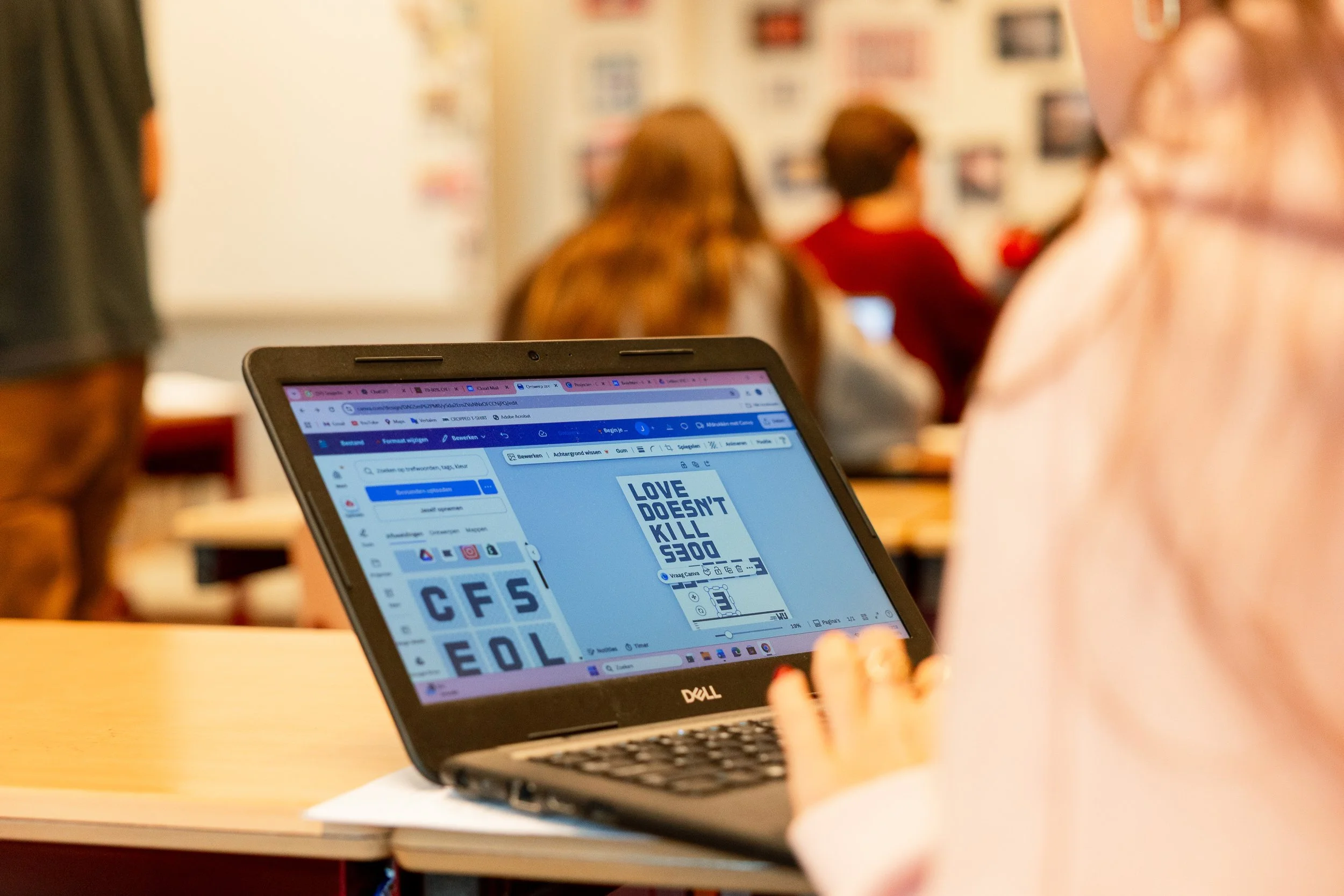
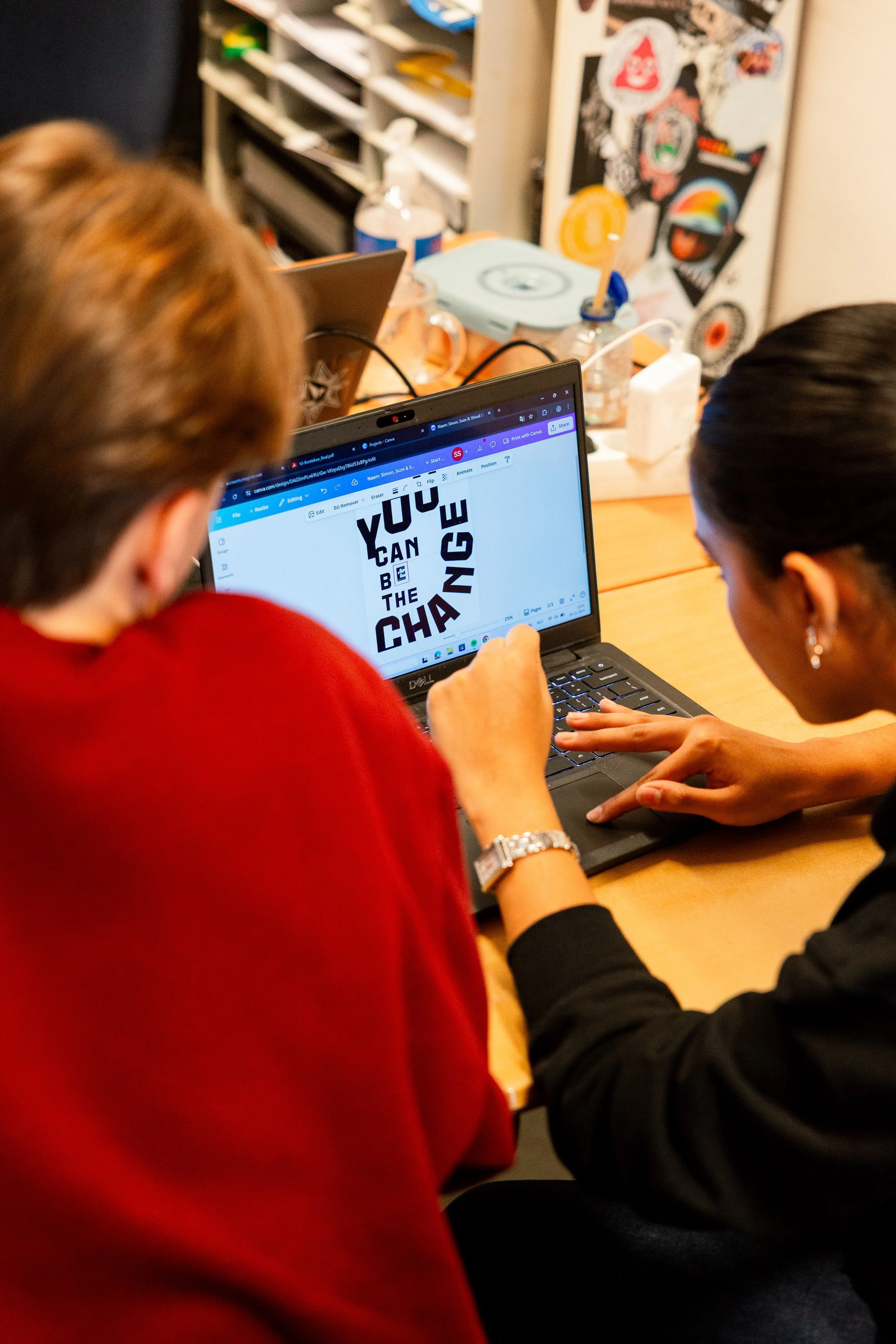
• Anton De Kom
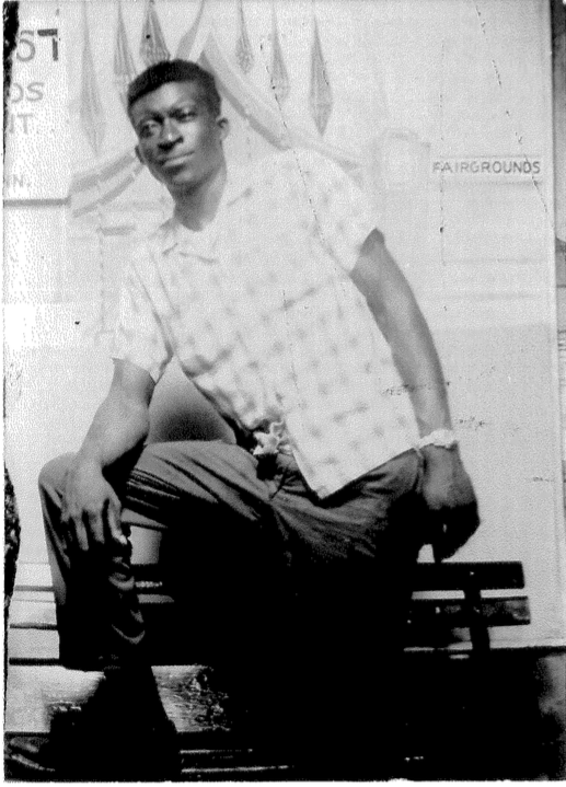
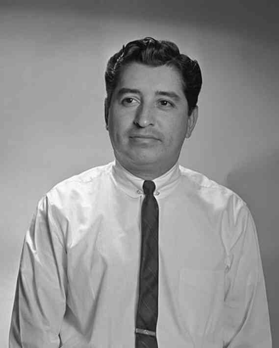
Anton de Kom was born in 1898 in Paramaribo, Suriname, into a family still shaped by the direct consequences of slavery. His father had been born enslaved.[4] In the 1920s, he moved to the Netherlands and became involved in anti-colonial and left-wing movements.
His book Wij slaven van Suriname, published in 1934, was the first history of slavery and Dutch colonialism in Suriname written from a Surinamese perspective.[4] He argued that abolition had not ended inequality or racism, but had reshaped them.
When he returned to Suriname in the early 1930s, colonial authorities monitored and restricted his activities. On February 7, 1933, a protest demanding his release from detention turned deadly when police opened fire, killing two people and wounding dozens more.[5] He was deported to the Netherlands and prevented from returning.
During the German occupation, he joined the Dutch resistance and wrote for underground publications. Arrested in 1944, he was deported to Germany, where he died in April 1945, just weeks before liberation.[5] For decades afterward, his work remained largely absent from Dutch education and public life, unknown to most Dutch students, including the Surinamese-Dutch activists who would later campaign for his recognition.[5]
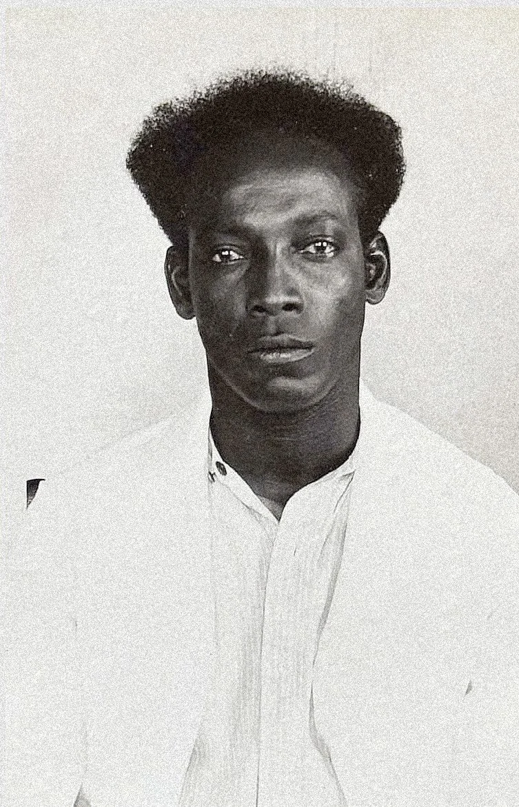
[1933] Mugshot of Anton de Kom. Police photo, Paramaribo. Learn More
• Anti-colonial and migration struggles
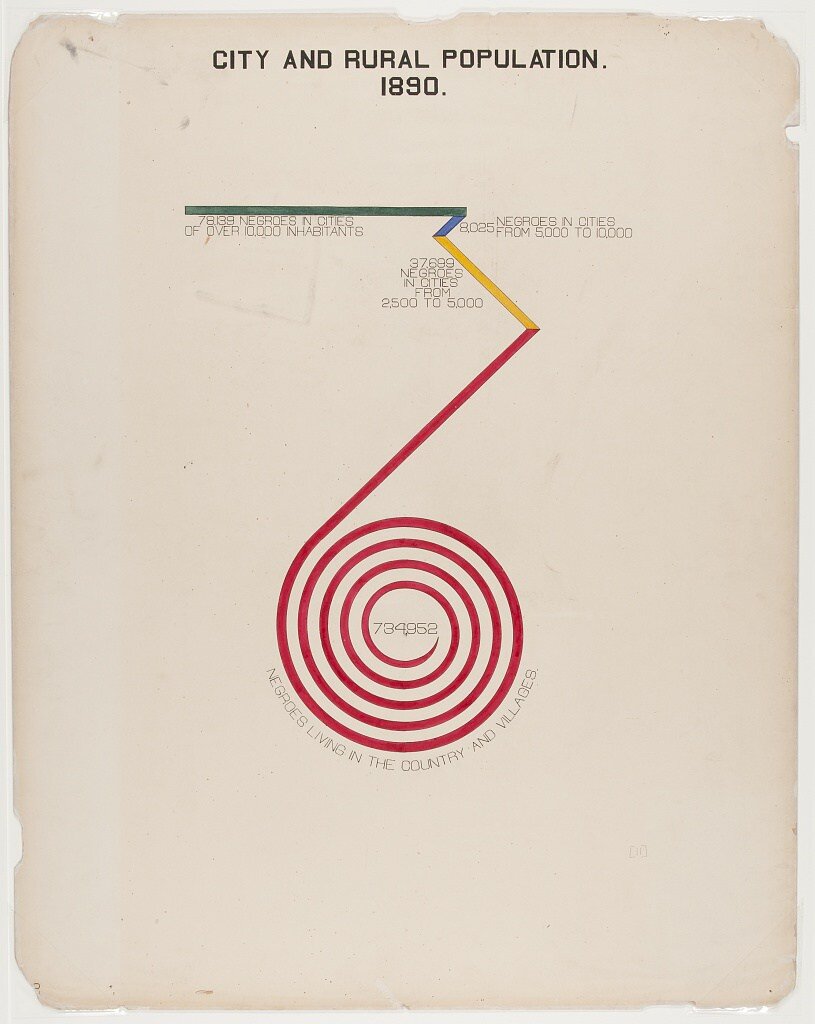
In the aftermath of the Second World War, Dutch colonial authority began to fracture. When Japan surrendered in August 1945, Indonesian nationalist leaders declared independence two days later. The Dutch government refused to accept it and launched a four-year military campaign across Java and Sumatra, conducting two major offensives they termed "police actions." The conflict ended only under sustained international pressure. The United States threatened to withhold Marshall aid if the Netherlands did not transfer sovereignty. Dutch recognition of Indonesian independence came on December 27, 1949, more than four years after Indonesians had first declared it.[6]
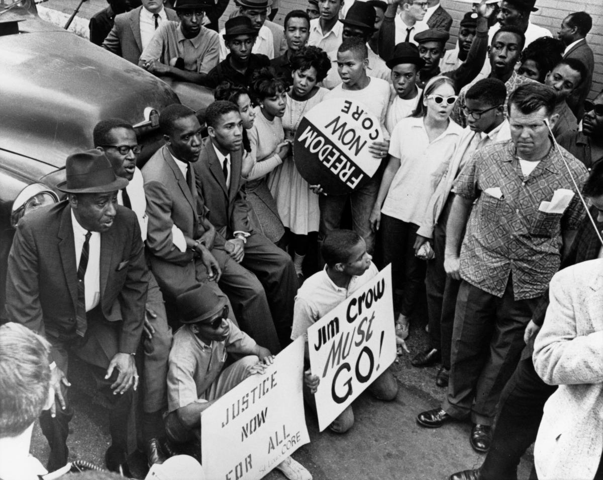
Suriname became independent on November 25, 1975.[7] In Amsterdam, the city attempted to restrict certain neighborhoods from settlement by Surinamese migrants, a practice of racially coded housing exclusion that community organizations documented and challenged directly.[8] LOSON, the national umbrella organization for Surinamese groups in the Netherlands, had been organizing since 1973 around anti-colonial, anti-racist, and labor issues through public protests, published materials, and parliamentary advocacy.[9] These were the same organizers who would, in 1988, lead the campaign for the rehabilitation of Anton de Kom.
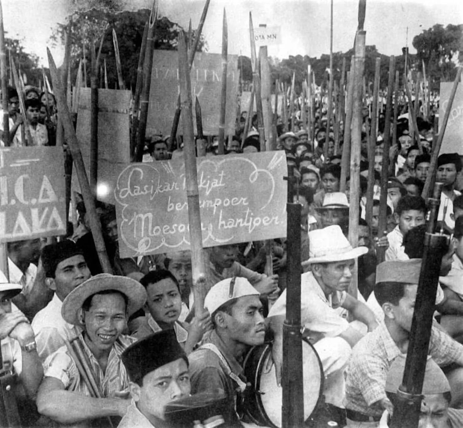
Indonesian independence fighters in 1945. Most are armed with bamboo spears. Tropenmuseum/National Museum of World Cultures., CC BY
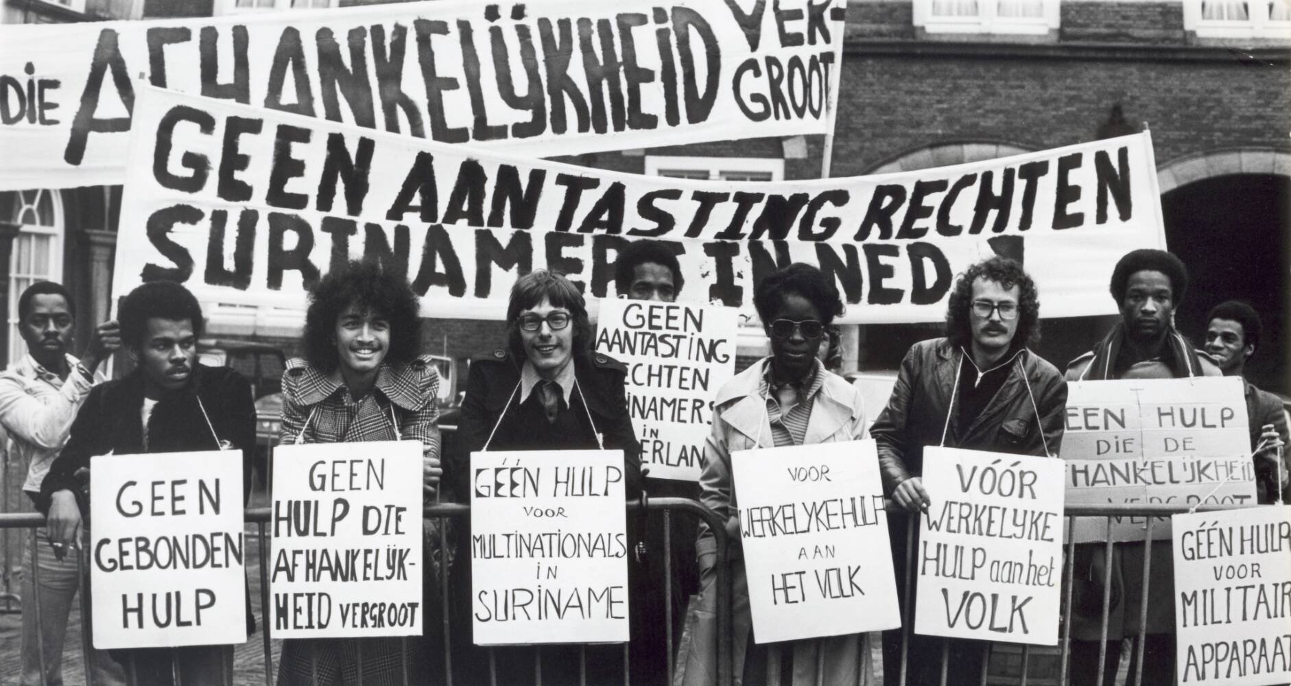
[1975-10-21, The Hague] Demonstration during the debate in the House of Representatives on the independence of Suriname, with the participation of members of the Surinamese Parliament. Outside, people are standing with signs and banners with various slogans. Learn More
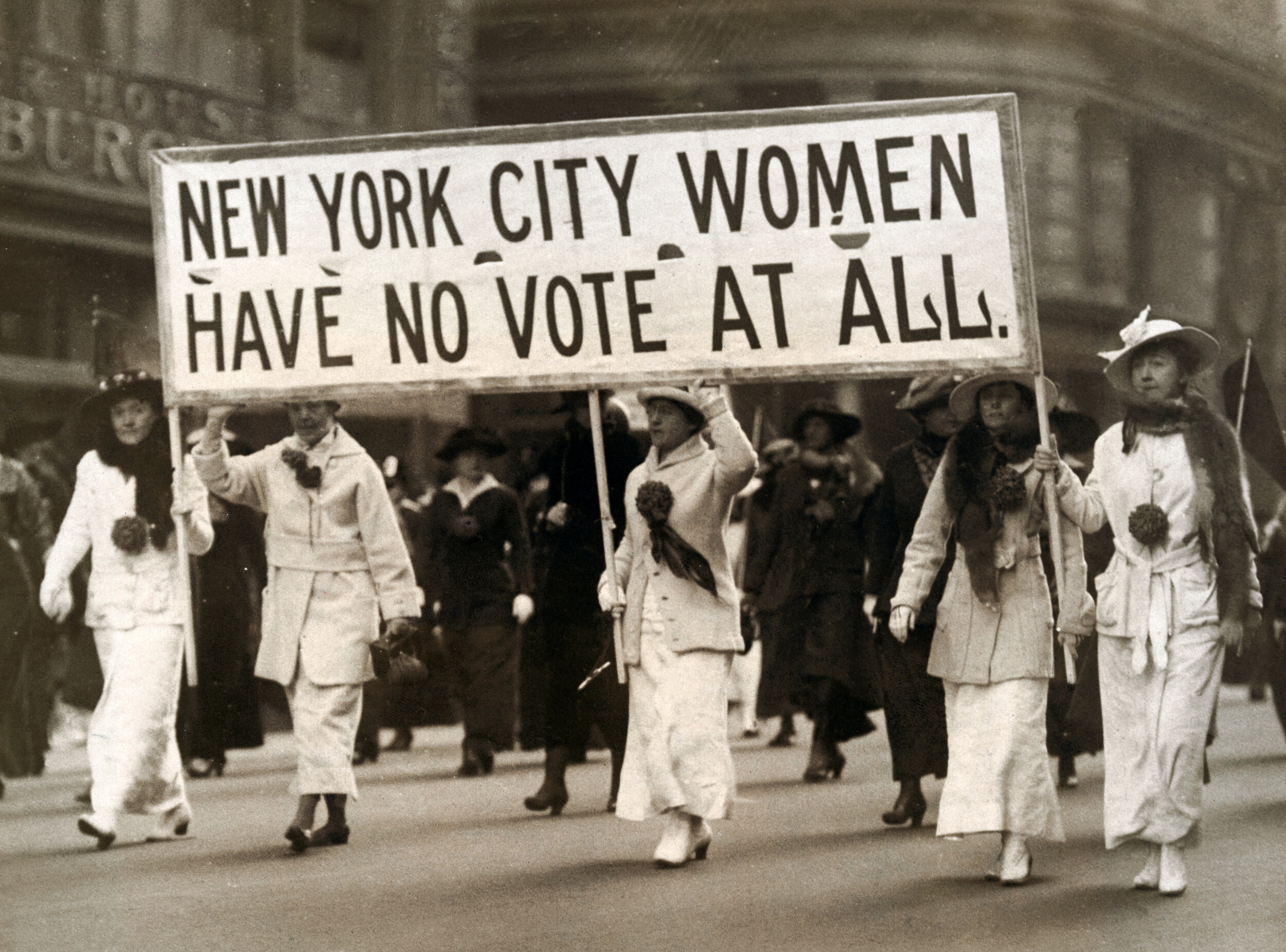
• Women’s rights movements
In the late 1960s and 1970s, feminist movements in the Netherlands made their demands visible through direct public action. Dolle Mina emerged in 1969, organizing demonstrations that combined urgency with humor. They stormed Nijenrode Castle, a private business university open only to men, burned a corset at the statue of Wilhelmina Drucker, and blocked public urinals with pink ribbons to protest the absence of public toilets for women.[10] In a Netherlands where working women were still legally fired upon marriage, their working groups addressed equal pay, abortion rights, childcare, and support for single mothers.
Founded in 1974, Wij Vrouwen Eisen broadened the campaign into a coalition drawing from across political and social groups. Their three demands were decriminalization of abortion, inclusion of abortion in health insurance, and a woman's right to decide.[11] Their banners introduced distinctive letterforms shaped by repetition and clarity, including a consistent rendering of the Dutch digraph IJ, two characters functioning as a single unit in the language.
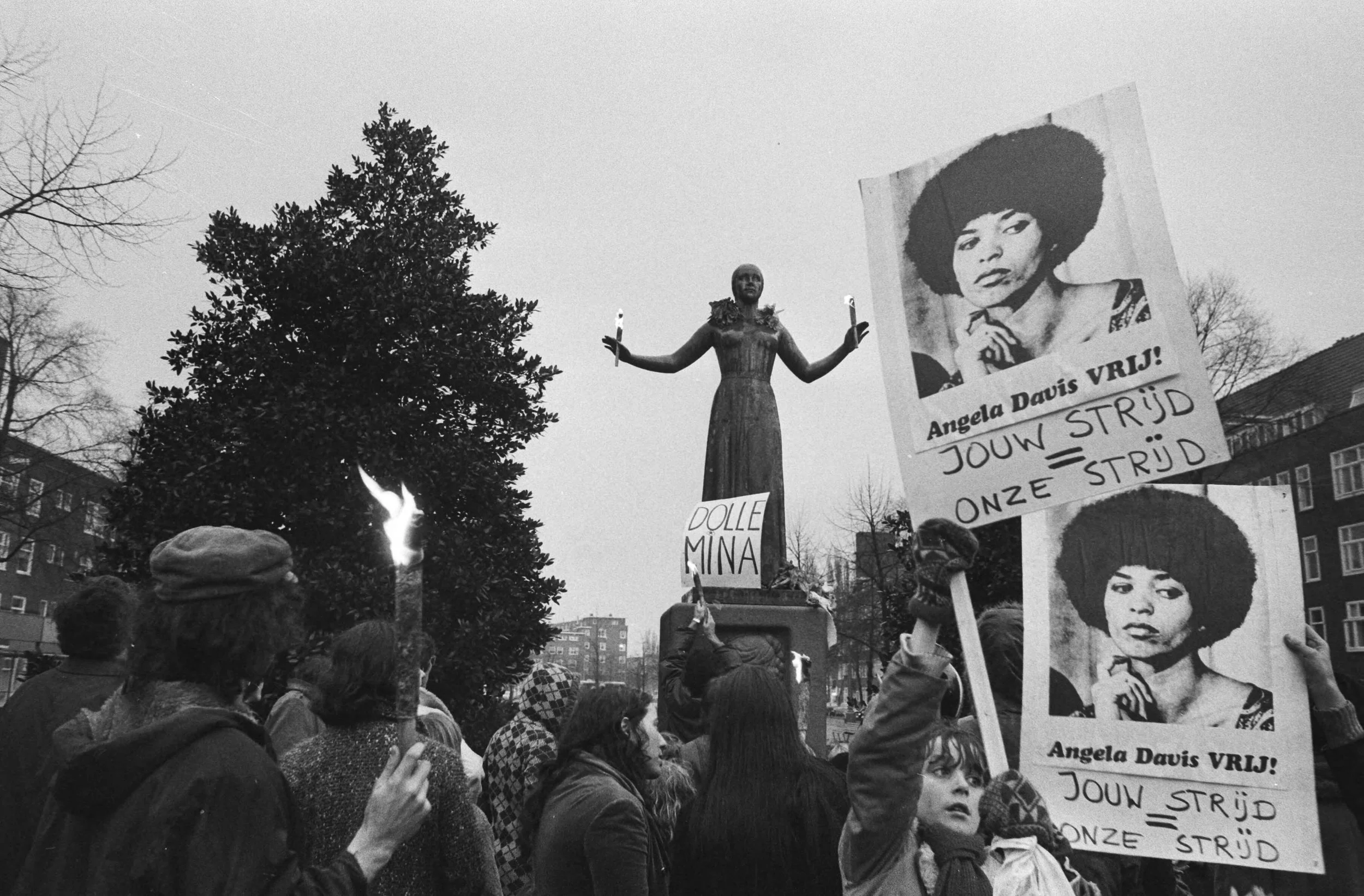
[1971-01-30] Dolle Mina's celebrate first anniversary, Amsterdam; demonstration including for Angela Davis at the Wilhelmina Drucker Monument on Churchilllaan. Learn More
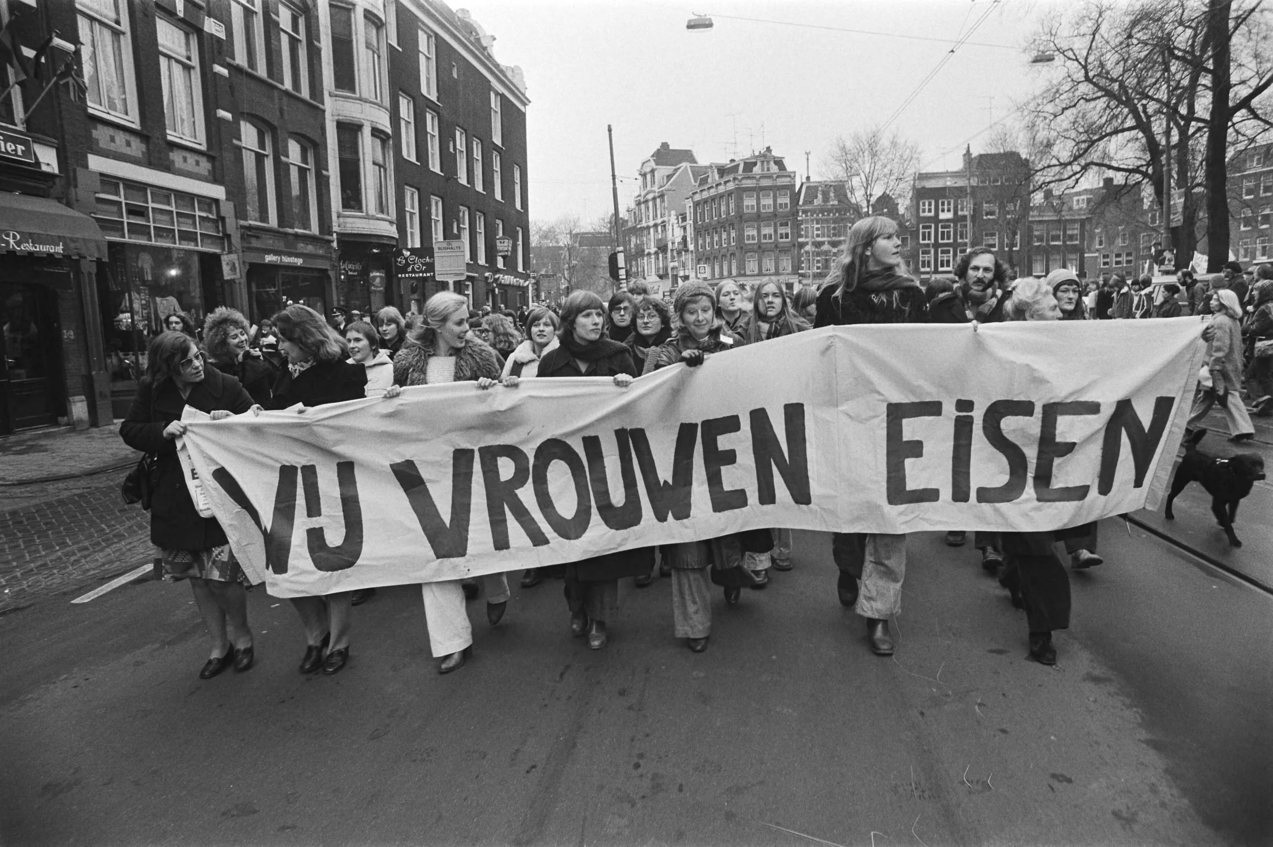
[1976-12-18] "We Women Demand" ("Wij vrouwen eisen") demonstrates in Amsterdam against decision on abortion bill; en route. Learn More
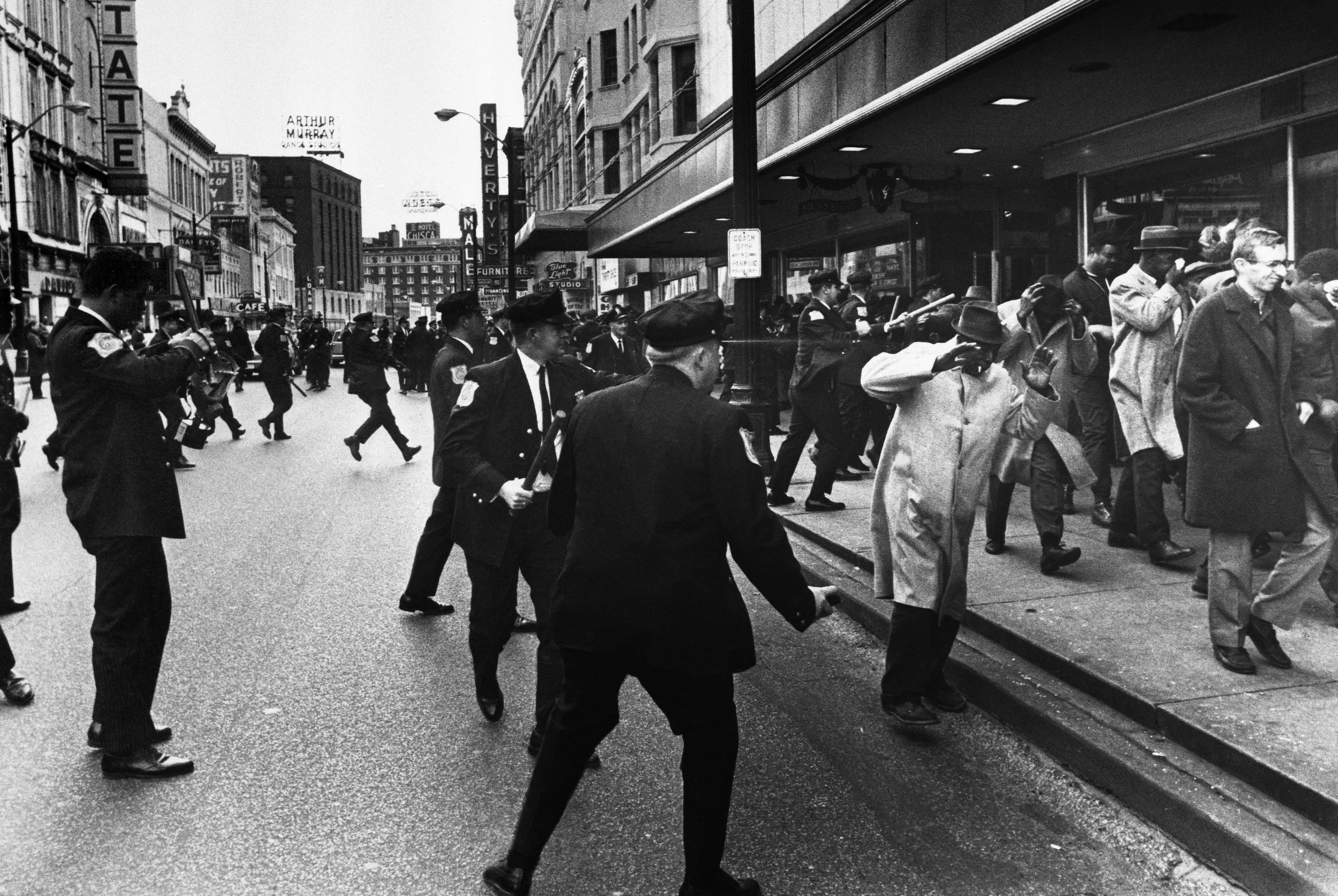
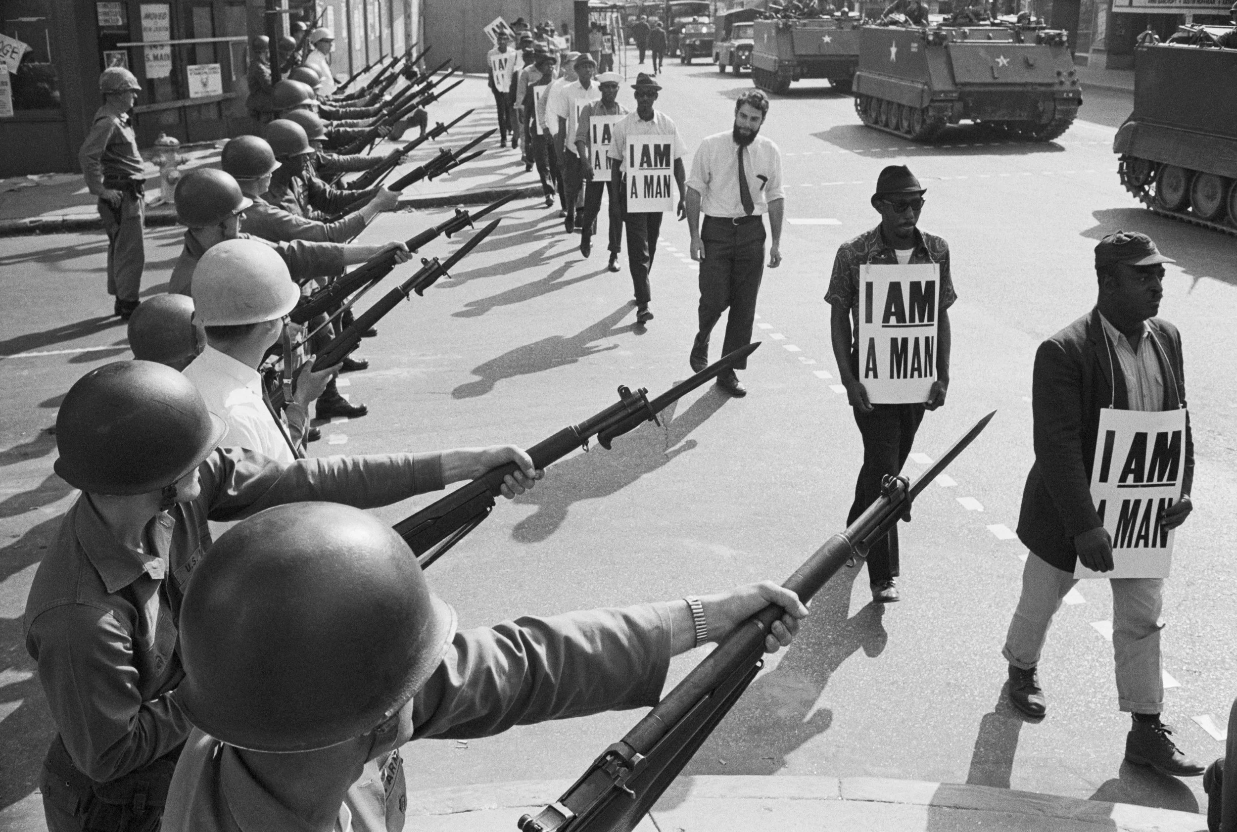
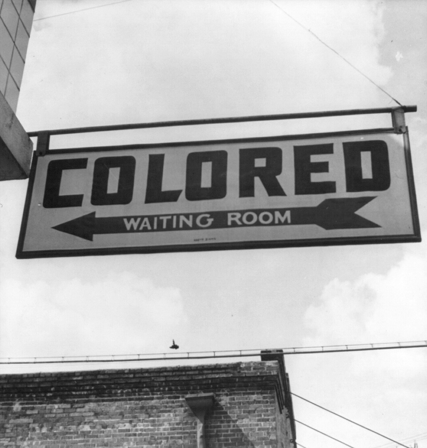
• Public space and civil rights
In January 1969, one of the first public demonstrations for gay and lesbian rights in Europe took place at the Binnenhof in The Hague, five months before the Stonewall uprising in New York.[12] More than a hundred participants gathered, organized by student groups opposing Article 248bis, which set the age of consent for same-sex relationships at 21 while the threshold for heterosexual relationships remained 16. The COC, the Dutch gay rights organization, had opposed the same article since 1945 but exclusively through private channels. Article 248bis was repealed in 1971.[12]
In the years that followed, the squatters' movement responded to a national housing shortage and the deliberate vacancy of buildings by property speculators, occupying spaces and organizing collectively across the country.[13] This tension reached its most visible point in 1980, when protesters marched during Queen Beatrix's coronation under the slogan Geen woning, geen kroning: no housing, no coronation. It was one of the most significant episodes of civil unrest in the Netherlands since the end of World War II.[14]
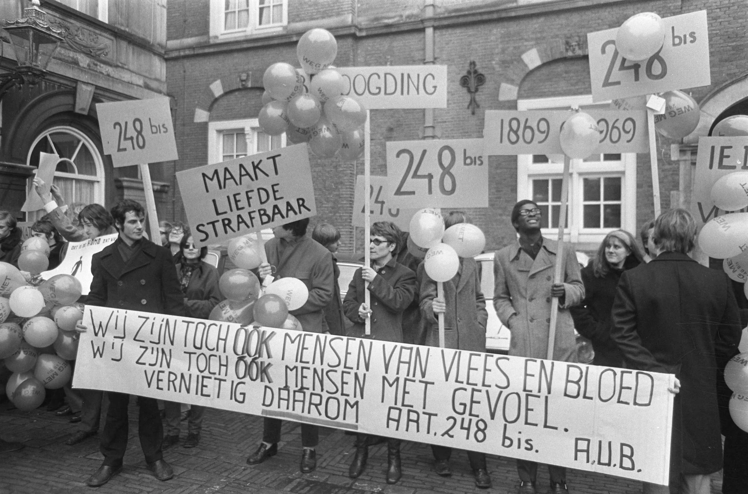
[1969-01-21] Demonstration against legislation regarding homosexual contacts at the Binnenhof: young people with banners and signs. Learn More
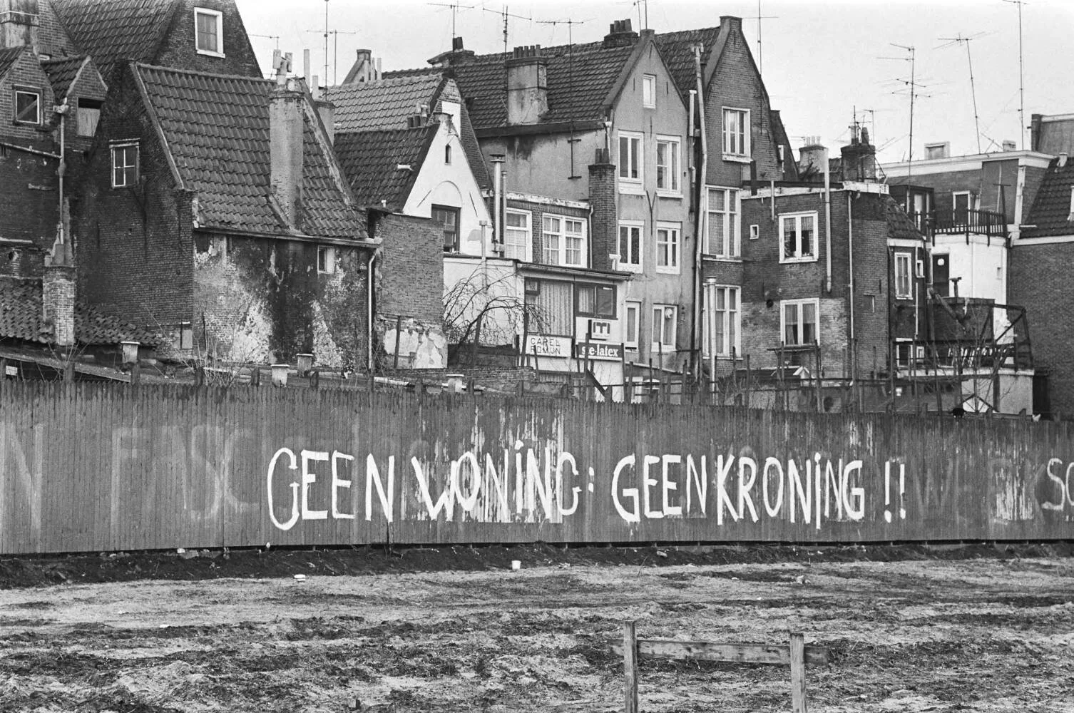
[1980-03-07] Commission for Volkskrant; text: "no home: no coronation" on a fence at the Haarlemmer Houttuinen. Learn More
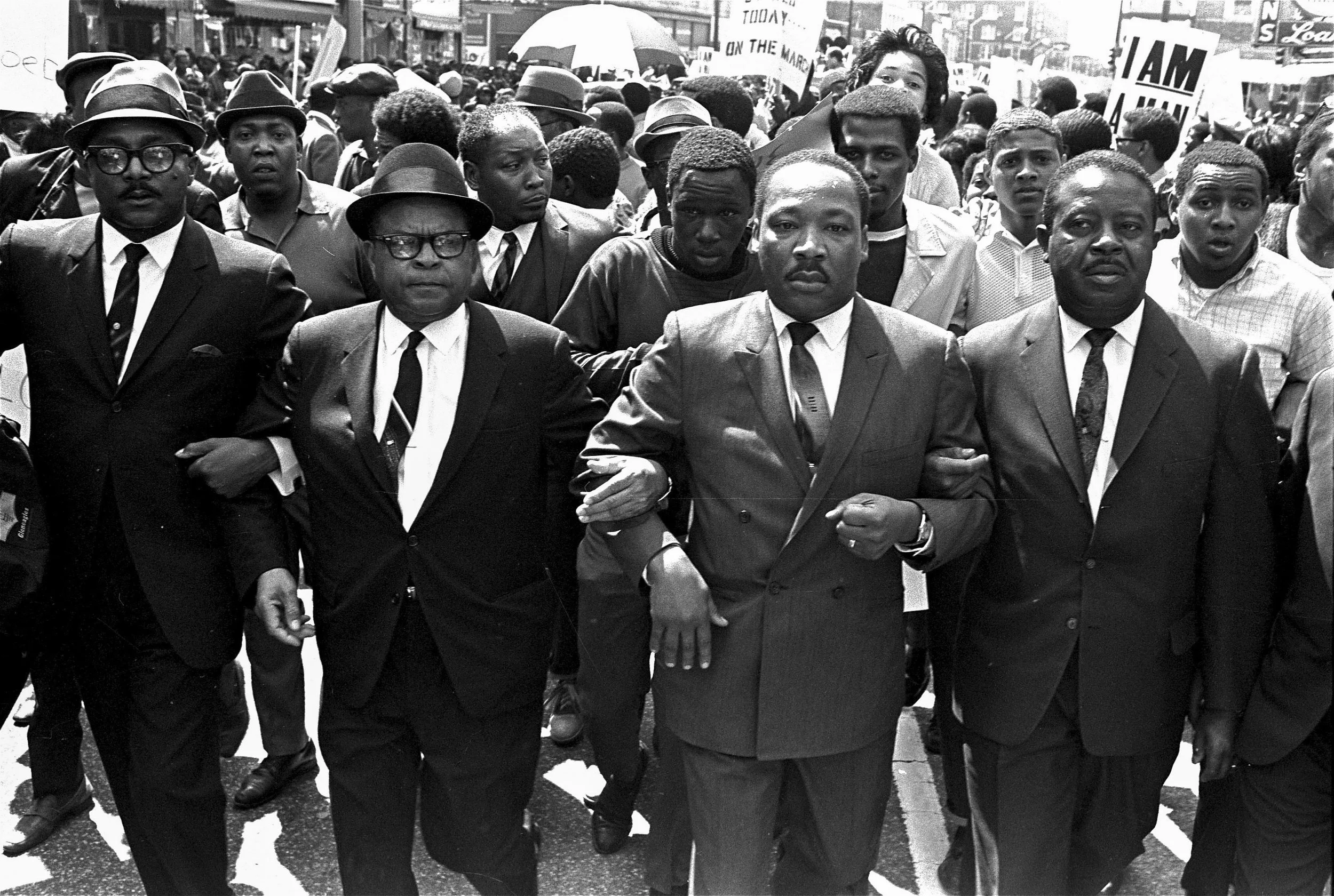
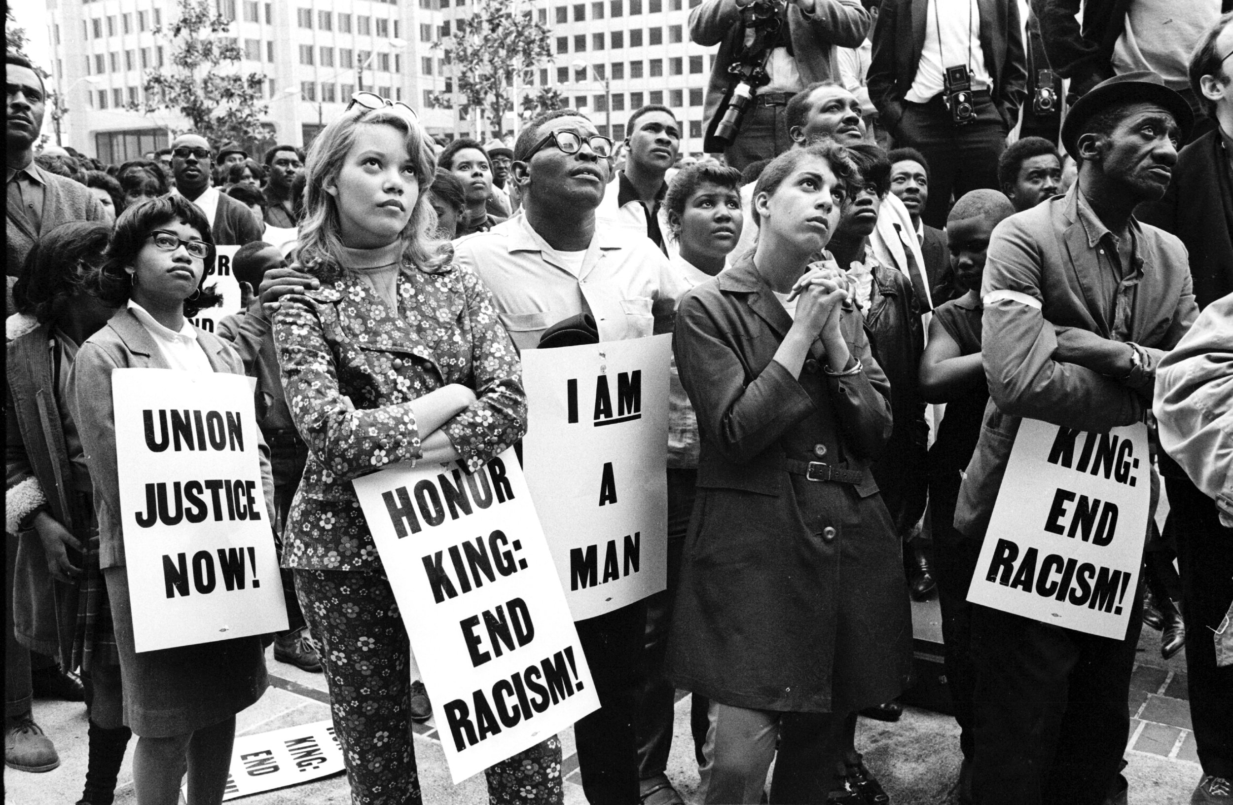
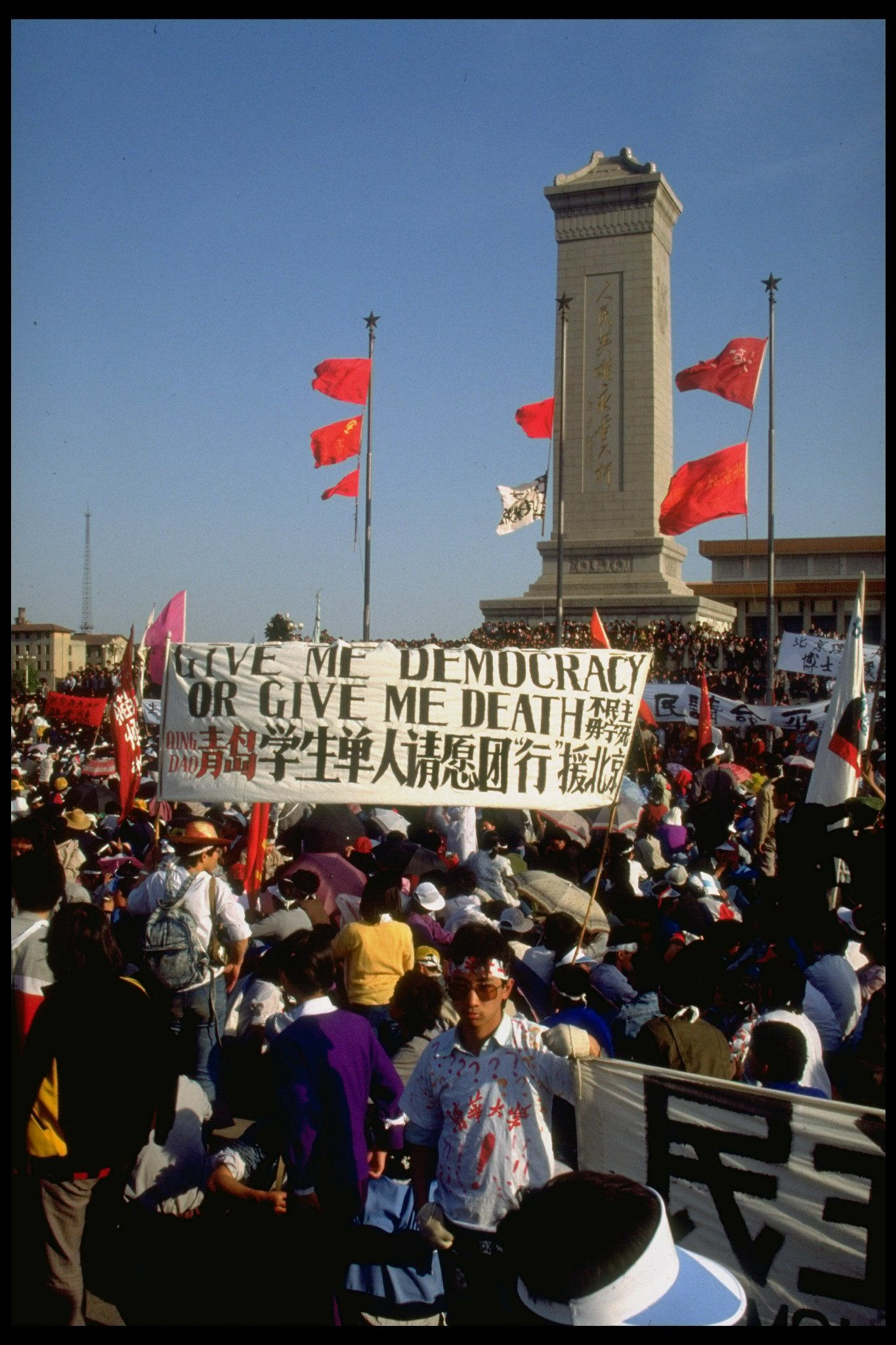
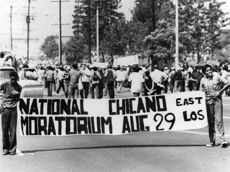
• Mass mobilization and scale
In November 1981, a demonstration against the nuclear arms race in Amsterdam drew an unexpected 400,000 people, the largest protest the Netherlands had seen since the end of the war.[15] During the period known as Hollanditis, a coalition of anti-military and peace groups organized against the deployment of American cruise missiles on Dutch soil, collecting over 3.75 million signatures. A second demonstration in The Hague in October 1983 drew an estimated 550,000 people.[16]
At this scale, communication depended on consistency and legibility, with messages designed to be read across large crowds and from a distance. The visual record of those years, hand-lettered banners filling the widest streets in the country, belongs to the same protest typography that the typeface draws from.
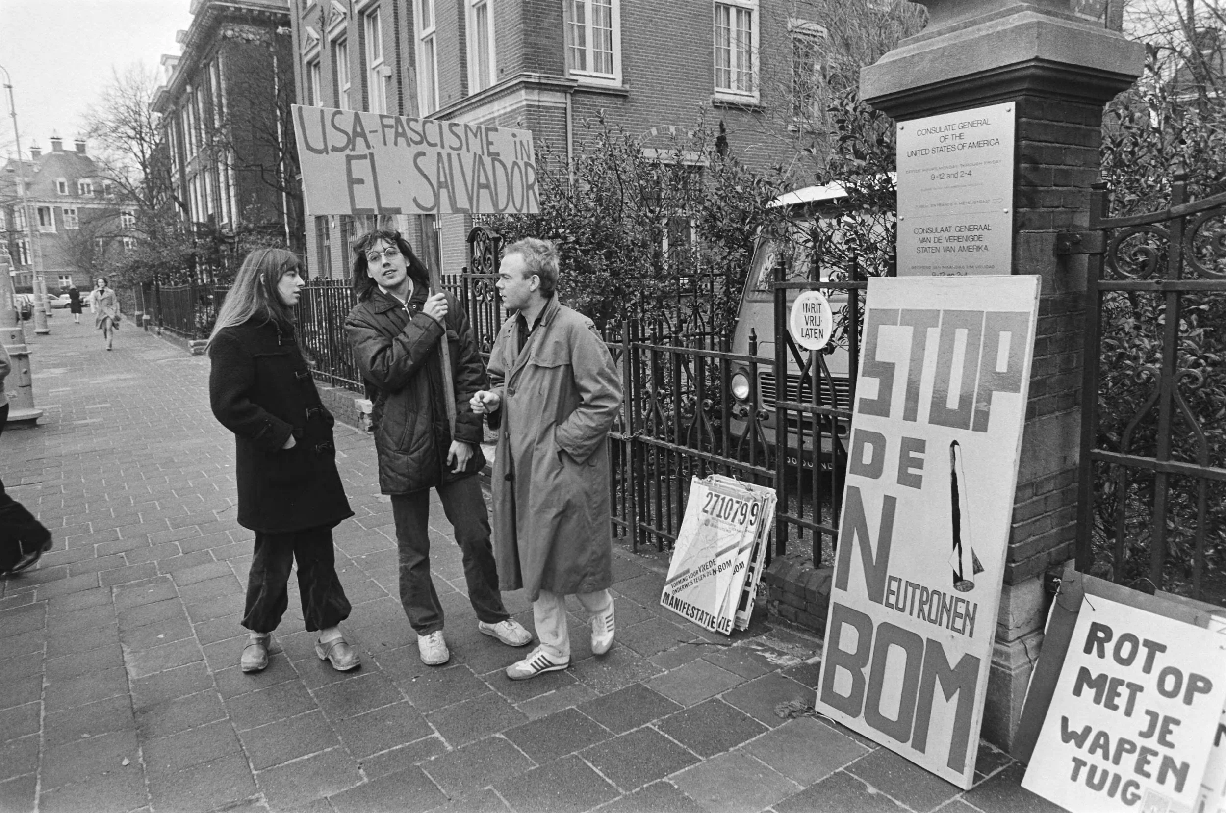
[1981-02-06] Demonstration against the introduction of the neutron bomb at the American consulate in Amsterdam. Learn More
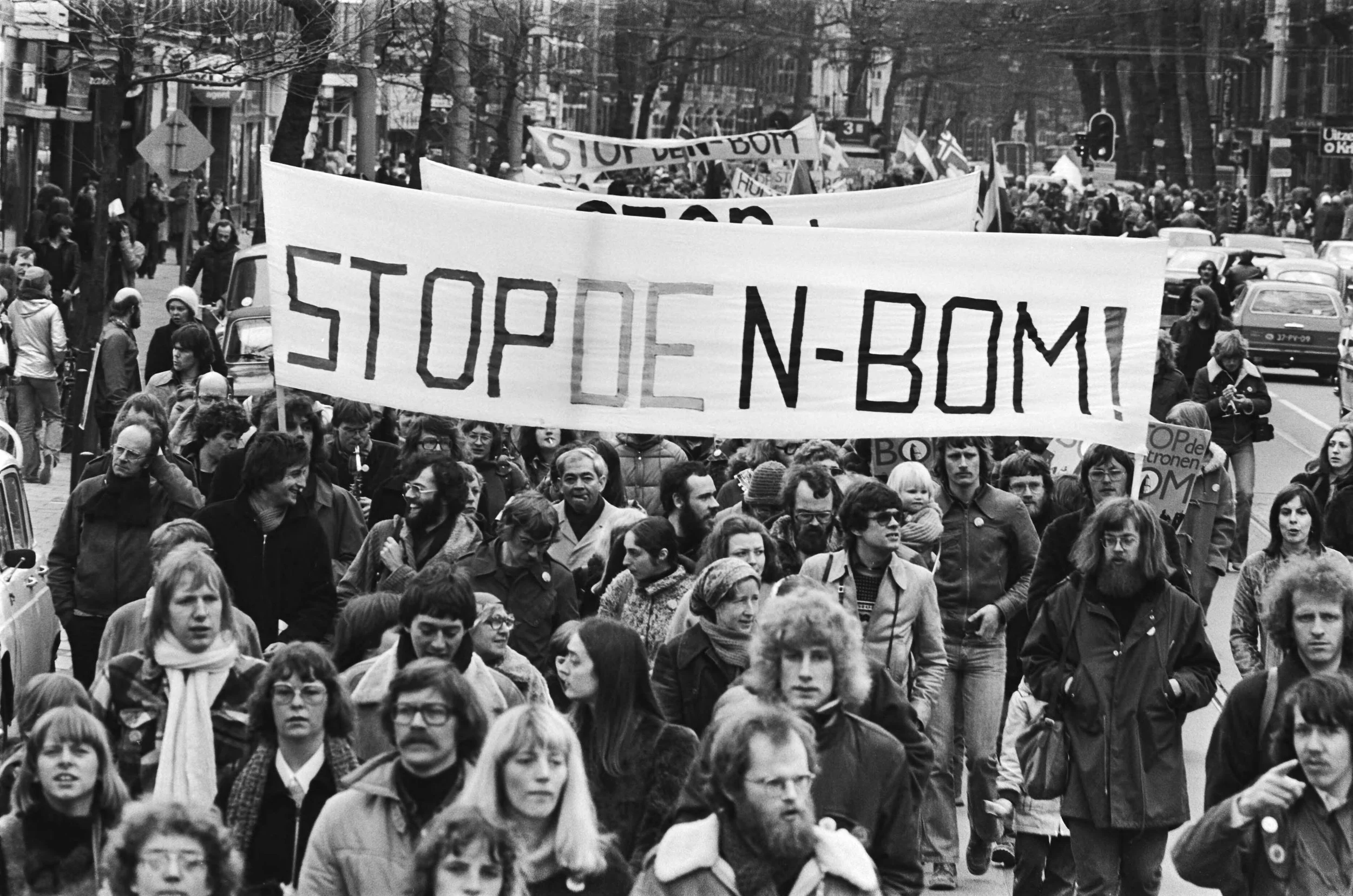
[1978-03-18] Massive demonstration against Neutron bomb; overview of the demonstration. Learn More
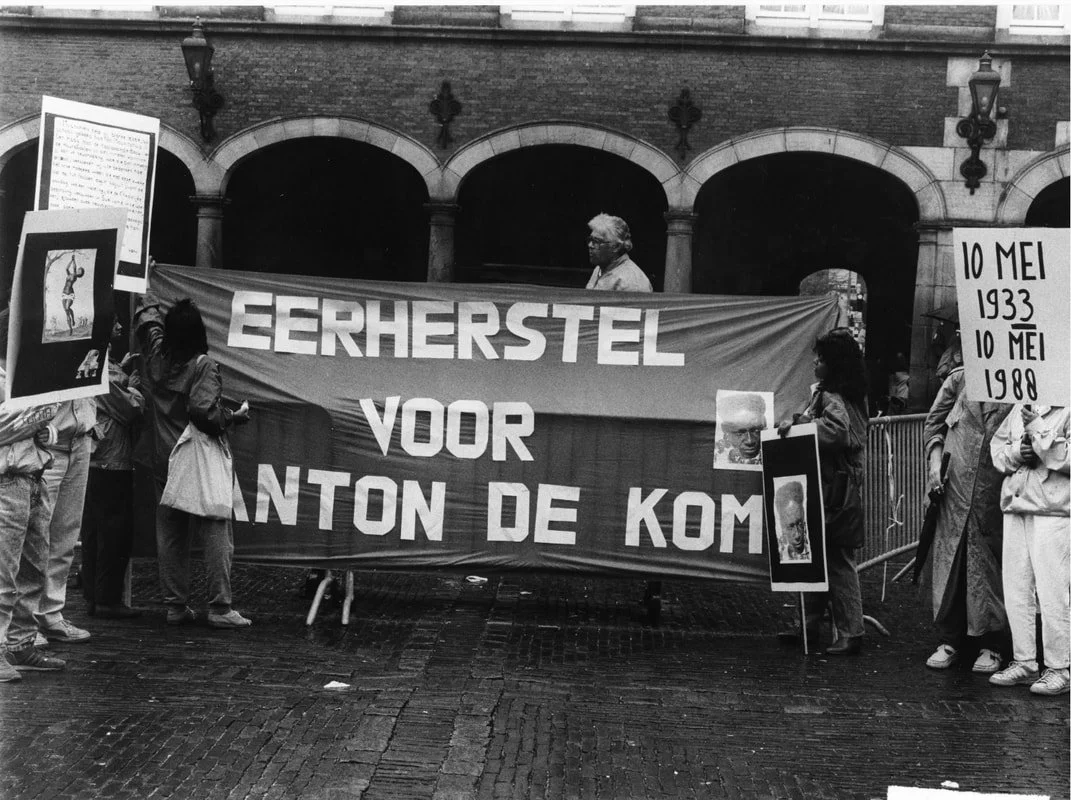
• Eerherstel, 1988
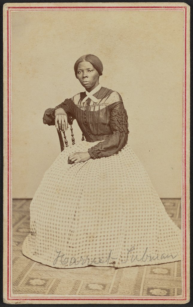
In the 1980s, Ernestine Comvalius encountered the work of Anton de Kom through independent research. His absence from formal education led her and other members of LOSON to study archival materials at the International Institute of Social History, working through newspapers and records from his lifetime.[5]
In 1988, the organization launched a petition demanding eerherstel, formal rehabilitation and official recognition, for de Kom. Without digital platforms, the campaign relied on printed materials, public demonstrations, and media attention.[5] A protest march accompanied the petition, along with a proposal to name a public square after him. A square in Amsterdam Zuidoost was eventually named in his honor, though broader official recognition developed more slowly. Among the materials produced during the campaign was a protest banner bearing his name.
• The Source
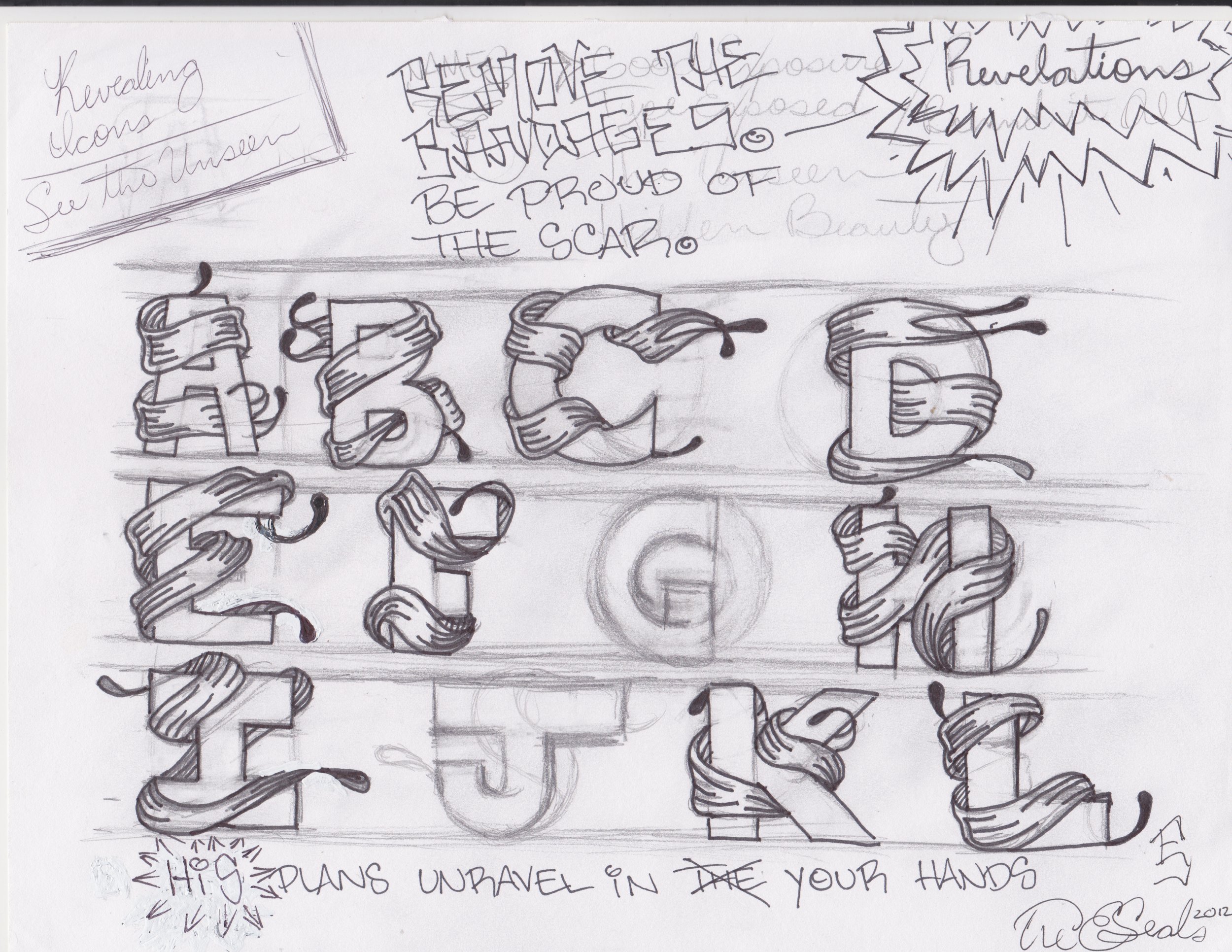
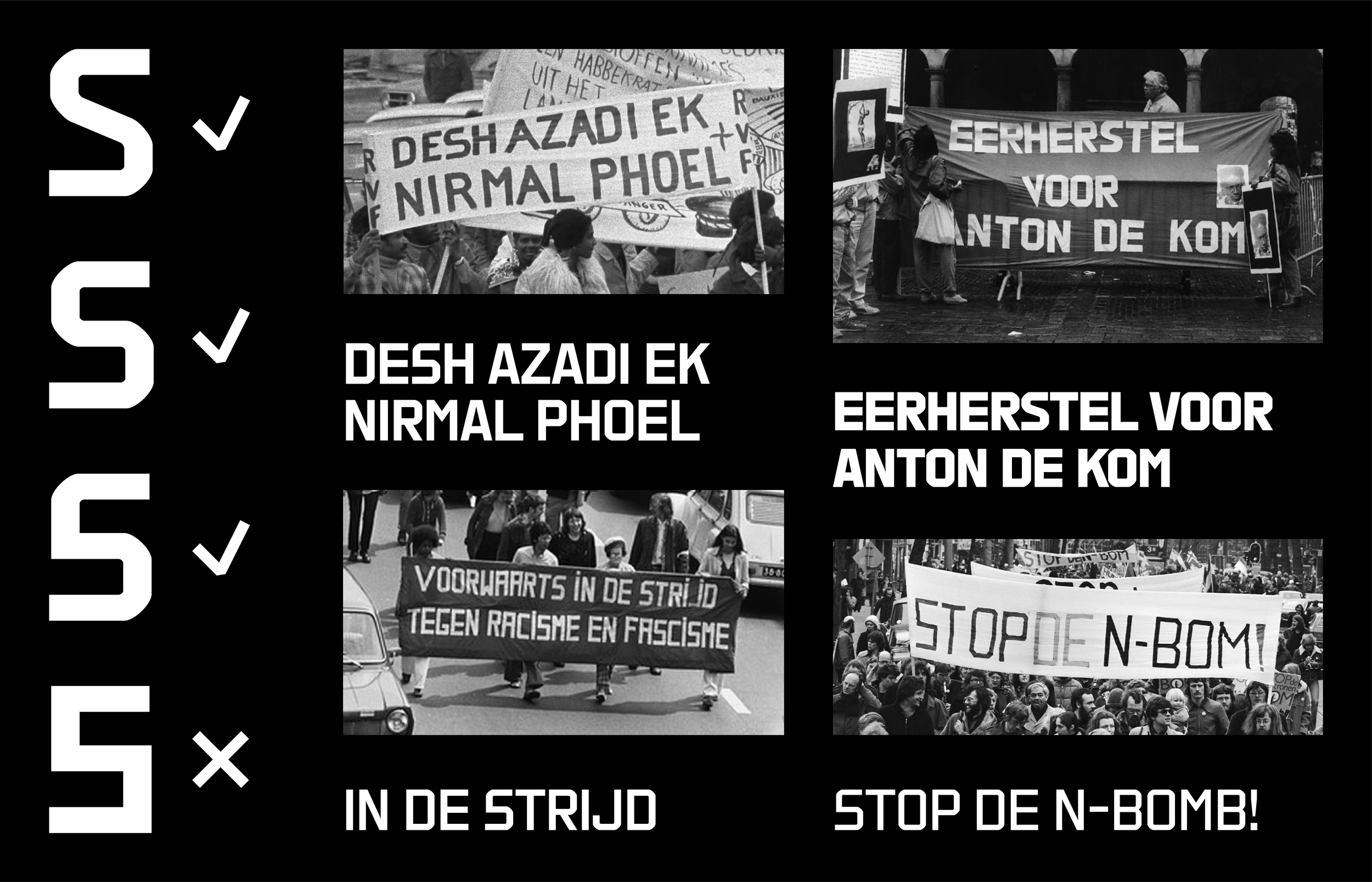
The 1988 banner forms the primary visual reference for VTC Wij. Its letterforms are upright, consistent in stroke weight, and nearly uniform in width. Each character occupies a similar horizontal space regardless of its internal structure.
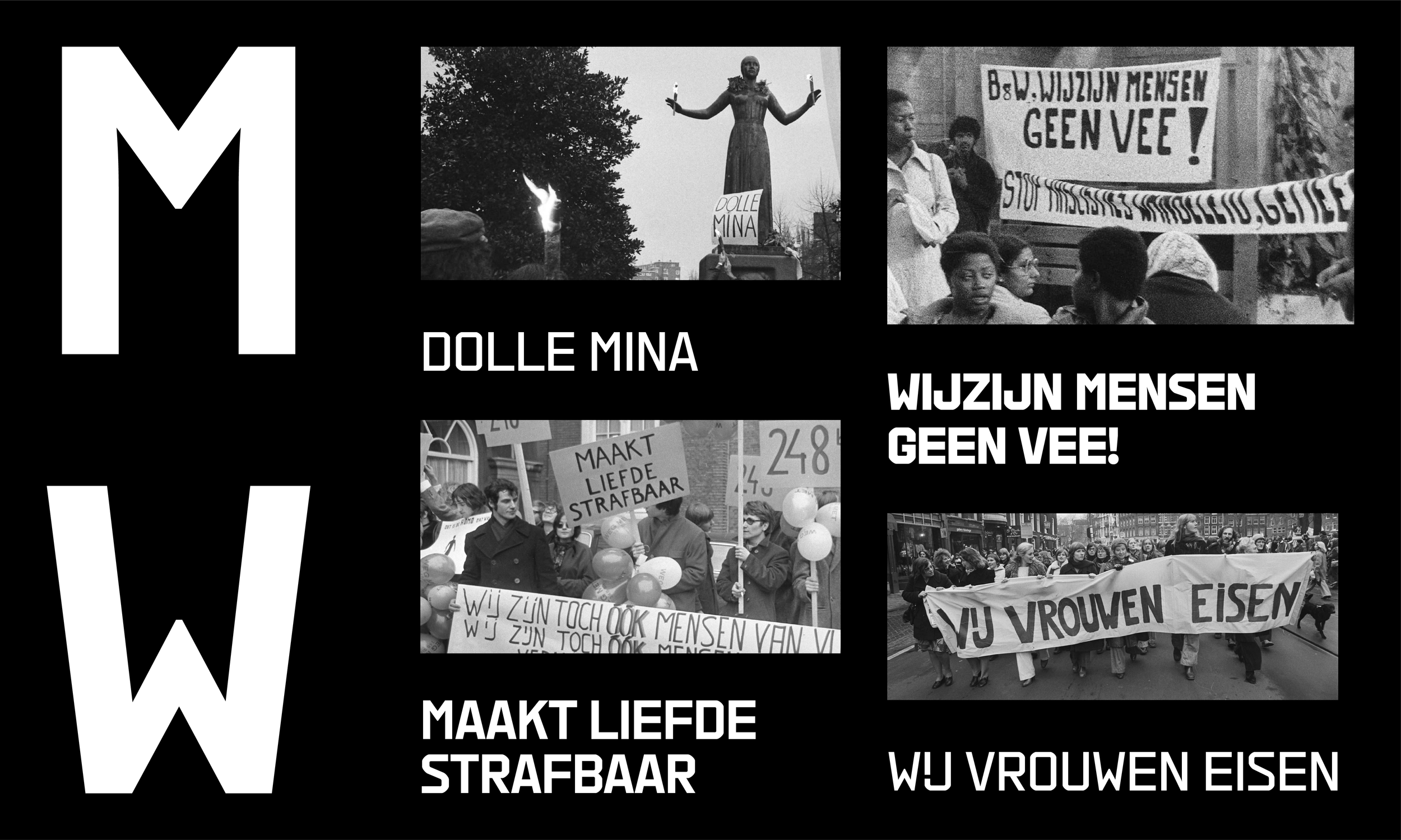
Because most reference materials were handmade rather than printed, the process focused on identifying what remained consistent across different hands. The uppercase S appeared in four variations throughout the archive. Three shared a structural logic that aligned with the broader letterform set and were included. A fourth, constructed entirely from vertical and horizontal strokes without curves or diagonals, was excluded. These selected forms informed the lowercase s and numerals 2 and 5, where fewer reference images existed. In the M and W, the central vertex consistently sits at or below the midpoint of the cap height rather than reaching the top, a characteristic of letters drawn quickly and at scale by hand.
The Dutch digraph IJ, drawn consistently in banners from Wij Vrouwen Eisen, is incorporated as a single glyph, reflecting both its role in the language and its place in the visual archive.
• From Archive to Use
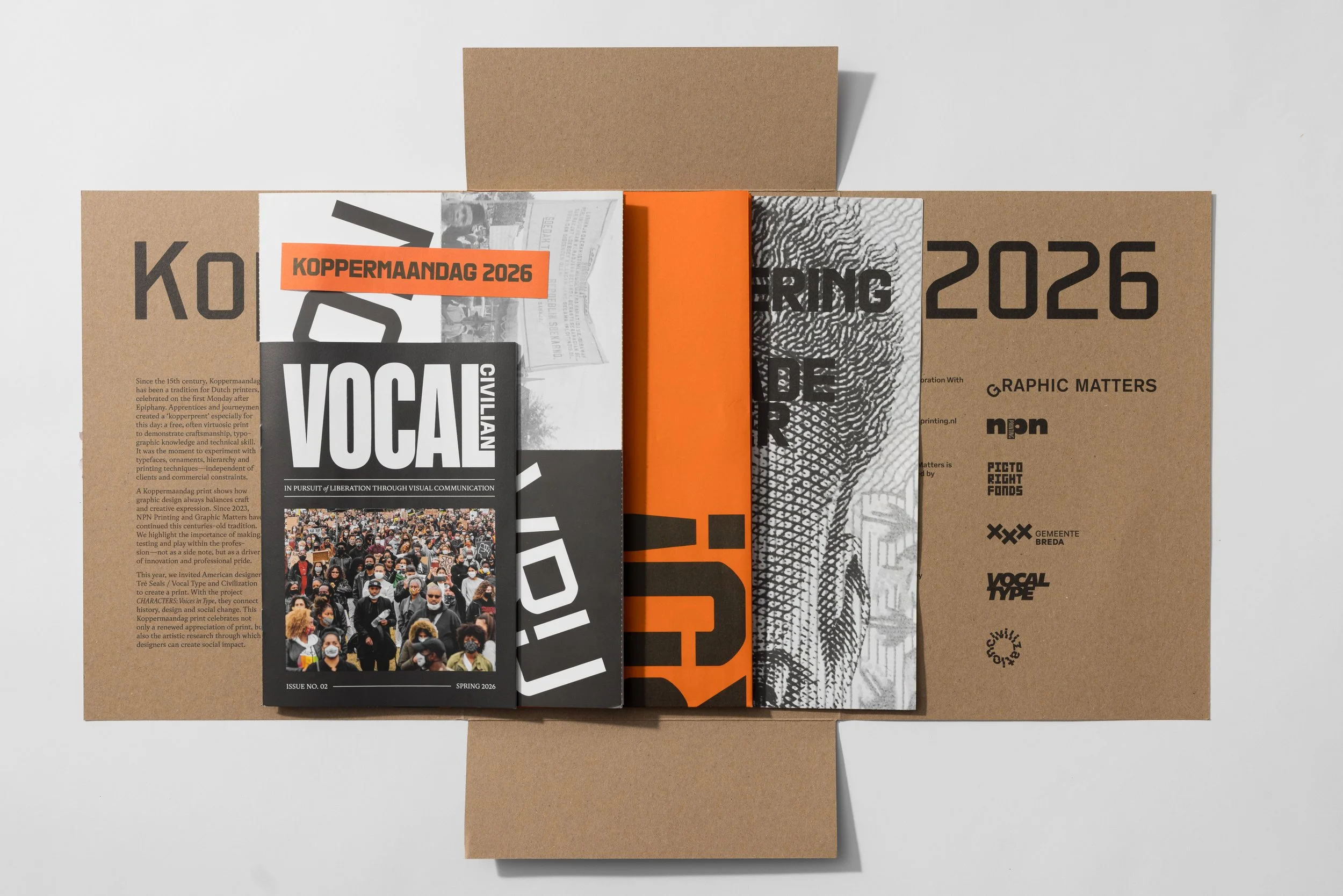
The typeface was first used in the CHARACTERS: Voices in Type mural in Breda, where de Kom's declaration was painted across 105 meters in a single day. The project extended into a poster exhibition at 3sec Gallery, a publication produced for Koppermaandag,[17] and a design conference examining typography as a tool for public memory.[3] In workshops with secondary school students, participants used VTC Wij to design their own protest posters, addressing issues relevant to their own lives and communities.[2]
REFERENCES
[1] Graphic Matters, “CHARACTERS: Voices in Type”
[2] Graphic Matters, “Workshop: Laat Letters Spreken”
[3] Graphic Matters, “Voices in Type: Assembly”
[4] UnHerd, “The anti-racist who shames the Dutch”
[5] The Black Archives, “Eerherstel voor Anton de Kom is nog steeds nodig”
[6] Wikipedia, “Indonesian National Revolution”
[7] Britannica, “Suriname”
[8] Taylor & Francis, “Amplifying Voices: Engaging and Disengaging with Colonial Pasts in Amsterdam”
[9] Oxford Academic, “Claiming a Postcolonial Differential Citizenship”
[10] Atria, “Action Group Dolle Mina”
[11] Taylor & Francis, “1975–1985: A Catalyst for Global South-Oriented Advocacy by Dutch Feminists”
[12] Wikipedia, “LGBTQ Rights in the Netherlands”
[13] Wikipedia, “Squatting in the Netherlands”
[14] Wikipedia, “Amsterdam Coronation Riots”
[15] Wikipedia, “Hollanditis”
[16] Historiek, “Hollanditis en het massale verzet tegen kruisraketten”
[17] Graphic Matters, “Koppermaandag Print 2026”