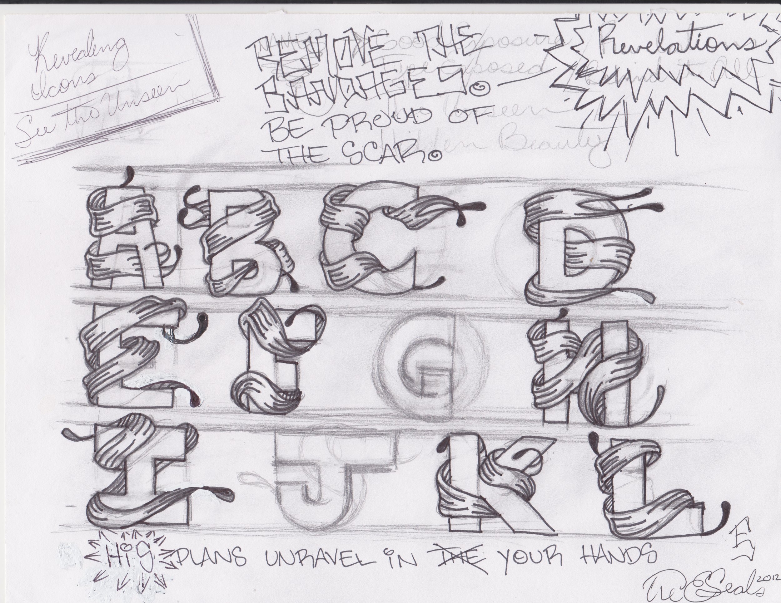
As I’m writing this, the year is 2023. However, this all began about two or three years ago when, during a post-lecture Q&A session, someone from the audience asked, “Do you consider yourself an activist, and if so, will you make a font inspired by your own story.”
I honestly didn’t know how to respond to that, nor do I remember my response to that. I just remember thinking that there would be this air of arrogance in naming a typeface after myself.
However, sometime later, I had a meeting with a potential partner (I don’t call people clients), and they mentioned that I’m very mysterious as there’s very little about me online beyond the fact that I founded Vocal Type, and a few statements about my work.
That’s when I realized that unless you attend one of my lectures, you know very little about me. So here we are.
It’s a long read, but I promise I could not make it any shorter. and there’s a lot of scrolling, but I hope enjoy.
Part 1—The Redacted Biography
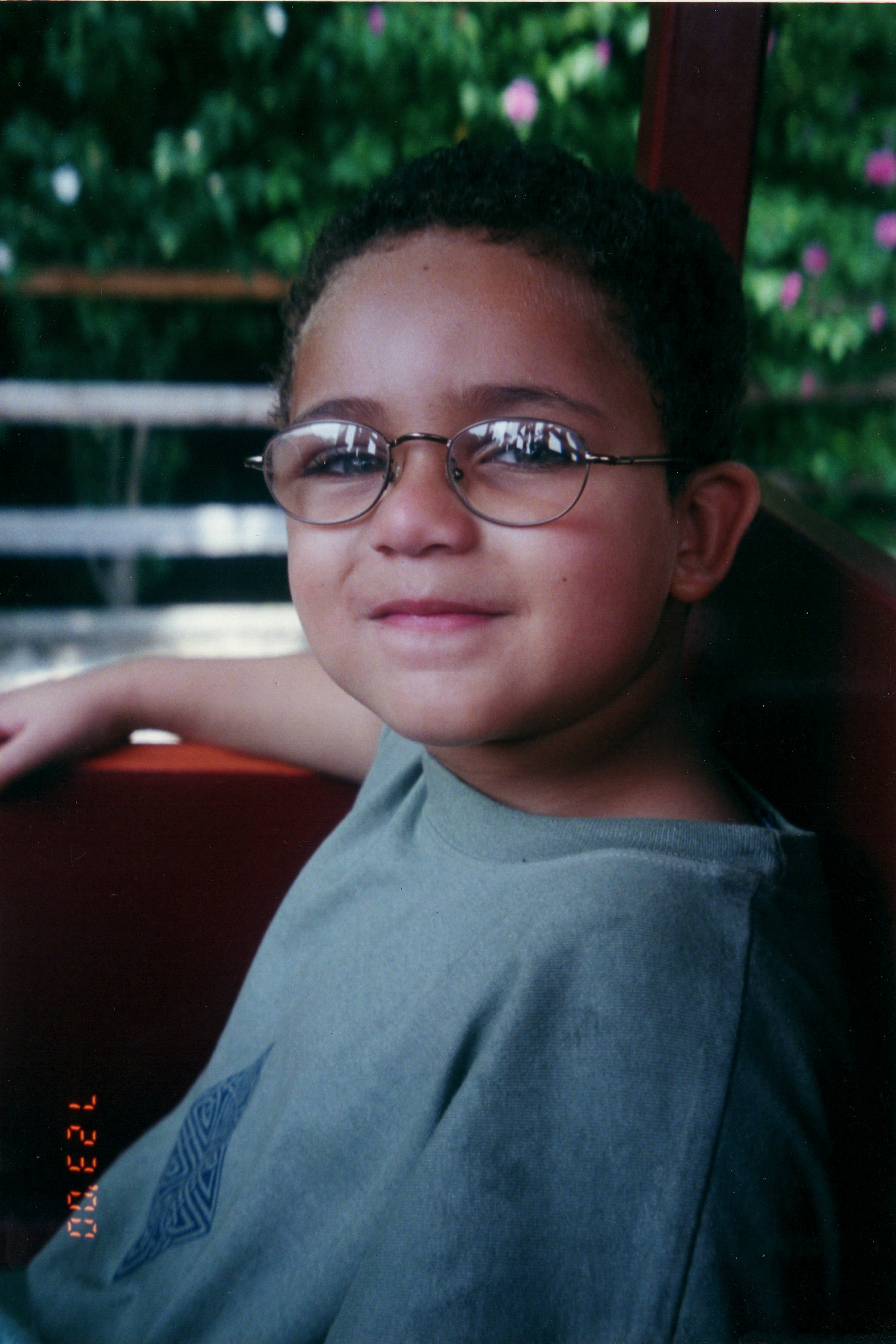
My journey began at the age of four. It started with a headache. And then excessive blinking. And then the headaches became paralyzing. I had a brain tumor. I was born with it, and as I grew, it grew with me until it became the size of a golf ball. I’ve recently learned that only 1-2 out of a million people get this particular type of brain tumor. Through that ordeal, drawing and writing became my only means of working through the pain. And even when the tumor was gone, I needed a way to express what I was feeling, so drawing and writing became my only means of doing that as well. So, I’d draw to my heart’s content. When I got tired of drawing, I’d practice writing in cursive until my handwriting looked like the sample sheets.
Four years later, just when I was becoming a real kid again, I was diagnosed with a residual brain tumor. That’s when everything changed. I was different. The way I thought about everything was different. Not like, ‘I think we should see someone about this,’ but more of a maturity type of different.
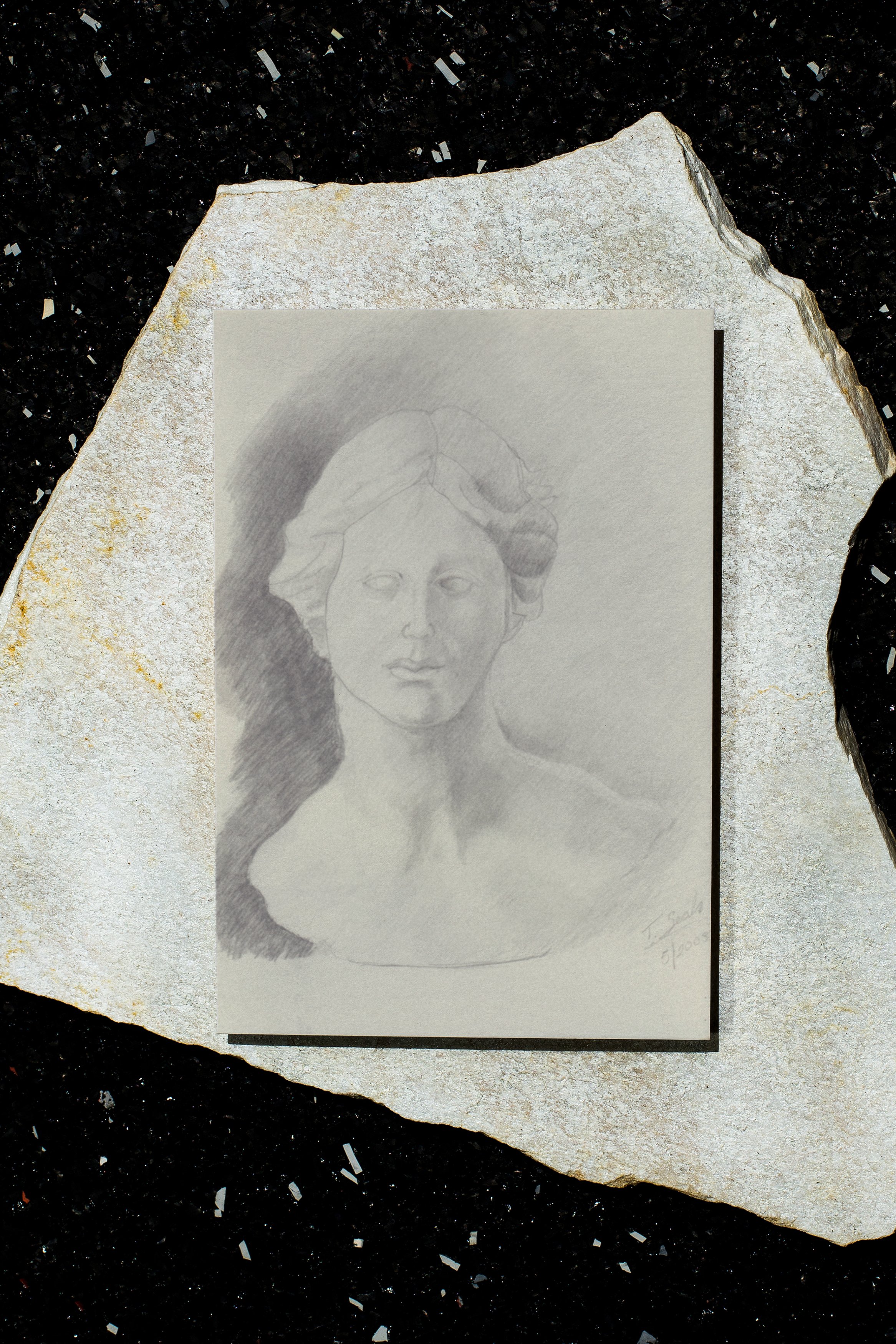
Instead of drawing pictures of skateboarders and basketball players, I was drawing pictures of Venus De Milo, David, Greek Columns, and broken chains.
Unfinished drawing of Venus de Milo from 4th grade
However, beyond just drawing, a lot was happening around that time: I experienced racism for the first time when I was in the third grade; I started learning more about Black and Brown history, which made racism way more confusing. All of these experiences, combined, made me more observant. They made me want to understand people more.
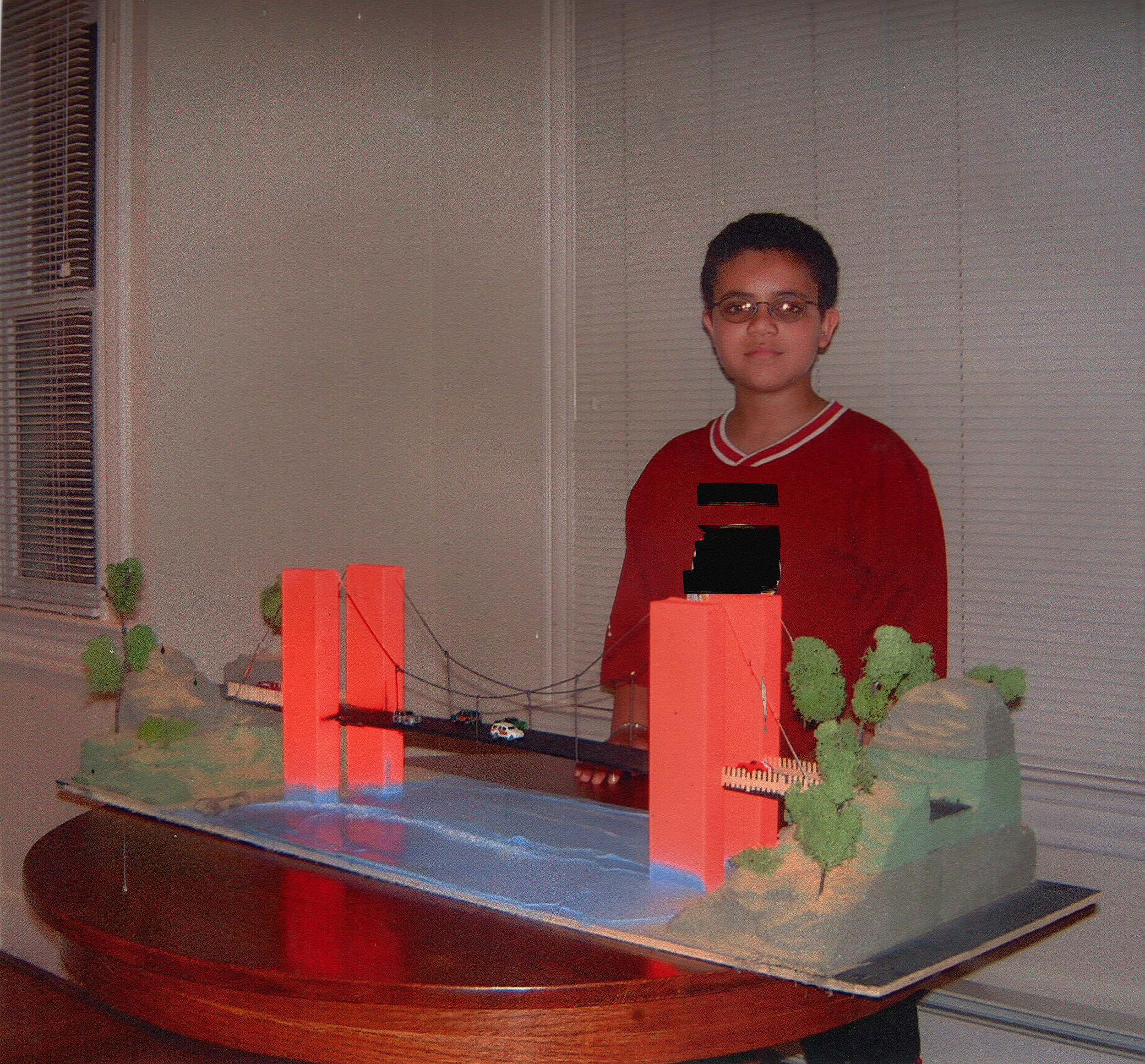
Suspension bridge design for 4th grade science class.
So I started observing the two people that I was around the most—my parents. I observed how they ran their business and how they treated their customers. It inspired me to start my own business. Plus, I had no allowance, but that is not the point. So, in the 5th and 6th grade, while I was supposed to be selling items at the school store, I was convincing kids to have me graffiti their name on an index card for $3. This was my sales sheet.
This experience made me realize that if I could make other people happy by doing what makes me happy, then that’s what I need 2 be doing for the rest of my life. So, from middle school through college, I was designing and selling tattoos, resumes, t-shirts, bead jewelry, posters, Lego™ jewelry, and more. I ran the comics section of the school newspaper, and I designed yearbooks for 3 schools. If I thought of it, I made it. If I wanted something, but couldn’t afford it, then I made it, and if people liked it, then I’d probably try to sell it.
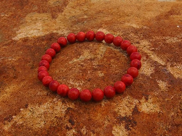
Beads and Photography by me (2009).
Beads and Photography by me (2009).
Aside from these creative hustles, I also started a 3 year long personal project. During my senior year of high school, I started drawing what would become the basis for my very first typeface. I didn’t know anything about type design back then, but I knew that one day I’d be capable of releasing it to the world.
And finally, in 2013, during my sophomore year of college, I finally did it. I unveiled “Unveil.” As for the sans serif part, it’s mostly some free Futura, because I knew a ton more about Illustrator than type design. But the end result was a multilayer vector font with 5 styles. That can be layered to create unique compositions like these.
Once the excitement died down, my passion became branding, but with an emphasis on typography, encouraged by a boss at an internship who pushed me to work on as many type projects as possible. Branding remained my passion, my specialty, but the education I received during that internship lit a spark in me. A few months later, while in my senior year of college, I made a pact with myself that by the time I was 25, I would become an internationally respected designer.
To make that pact a reality, I turned down art director positions at startups and a junior design position at Pepsi. I accepted a full-time position at a staffing agency where I had the opportunity to contract with eight or nine companies over the course of two years. I learned a lot about what kind of designer I wanted to be and the clients I wanted to work with. I worked for some ad agencies with bad morals and worse clients. I worked for a real estate tech company with whom I branded dozens of agents, which I enjoyed. I even worked on the rebranding of a Jewish community center, which was amazing.
However, in March 2016, while aimlessly scrolling for fonts while crafting another identity for another real estate agency (I did a lot of those back then), I just became really bored. Everything I saw, no matter how beautiful, all just looked the same. You could argue it’s because we are obsessed with grids and perfection, but the truth is there was no culture, no character – only monotony and stereotypes. While design is my passion, I started wondering if I had picked the wrong career.
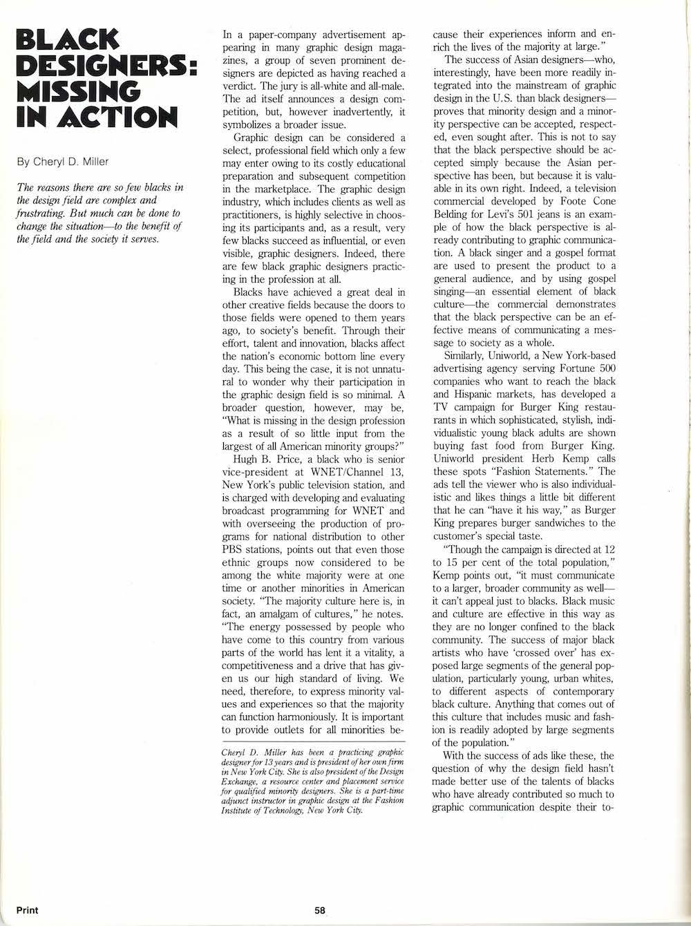
Simultaneously, soon after this experience, I read Dr. Cheryl Holmes-Miller’s 1987 thesis, “Black Designers Missing In Action.” It was one of the first times anyone mentioned the idea of diversity in design, summarising that while most industries are white male-dominated, if our job is to communicate an idea to Black and Brown communities, Black and Brown creatives need a seat at the table as one of the most underrepresented, but most influential, cultures in the industry.
Then one day, not long after, I came across the 1987 thesis by Dr. Cheryl Holmes-Miller, entitled “Black Designers: Missing In Action.” It was one of the first times that anyone really mentioned the idea of diversity in design. The article summarizes that when an industry, not just design, is white male-dominated, these industries can do more harm than good when the diversity of the world is not represented at the proverbial table.
But it wasn’t until I read her 2016 sequel, released just a few weeks later, entitled “Black Designers: Still Missing In Action”, That I became truly inspired. This version of the article was less analytical and was more so her way of passing the torch to the next generation of Black designers. It was because of this article that I began thinking, how can we effectively solve the problems and challenges of our clients when we’ve barely even faced any of the problems and challenges in our own industry? That’s why I decided to find a way to increase diversity in the graphic design industry. I knew for a fact that I couldn’t simply change the demographics, or the education system for that matter.
However, when I looked back on my life, and thought about the days of practicing my penmanship, and graffitiing people’s names on index cards, designing tattoos, and making Unveil, starting a font foundry just made sense.
However, I had to ask myself two very important questions: first, does the world really need another font foundry? And two, If I start a font foundry, what can I do differently?
In thinking about diversity, I also had to think about my racial experiences. Like the first time I encountered racism and bigotry in the workplace. And the first time I was called the “N-WORD.” And the first time I experienced racism, way back in the 3rd grade. However, I was also forced to evaluate my positive racial experiences. Like the first time I learned about Dr. King, Eva Peron, Bayard Rustin, Ruben Salazar, Dolores Huerta, and so many others, and the pride I felt in learning Black and Brown history.
I realized then that typography could be more than just a design tool but a tool for education and sharing stories, like the one I'm telling you right now. Because these stories are what connect us. I developed the idea for Vocal Type, a font foundry that would introduce a piece of minority culture into the root of any good graphic design work—typography.
I could end the story there and say that the rest is history, but it wouldn't be the whole story.
Vocal Type didn't come to be overnight. People told me I didn't know enough about diversity and inclusion to start coming up with solutions, but that fueled me even more. It fueled me to work harder. However, despite my efforts, Vocal Type wasn't gaining traction after four years of work.
But when the police murdered George Floyd, everything changed. I shut down my brand consultancy, Studio Seals, a few weeks later to focus solely on Vocal. The next thing I knew, Vocal was on every "Support Black Design" list. I went from 3,000 to 12,000 followers in a month. I started receiving emails from agencies and companies I could have only dreamed of working with asking me to do work with them. Yet, there was this burning thought that every opportunity I received was not because of my talent or efforts. It was because of George.
At the same time, this is what it took for me to realize precisely how vital Vocal was/is in the grand scheme of things. Since George’s murder, my typefaces have gone from being inspired by progressive movements to becoming a part of them.
PART 2 — Designing VTC Tré
Beyond the introduction, the design of VTC Tré came out of my need for a logo design. Aside from releasing this font family on my 30th birthday, I’ve also launched my personal portfolio site, treseals.com. I wanted a space to show projects like the Spike Lee book, and I only felt comfortable showing the custom type here.
As you probably know, designing your logo is the most challenging, most nerve-wracking project you will ever work on in your career (unless you’re the type to pick Helvetica and move on). As a storyteller, I wanted my logo and identity to embody my story.
At first, I wanted my logo to connect to my scars. That way, the logo would be a physical representation of me. I felt that, at the time, if I could figure out how to make that work, then I’d be set. Naturally, like most first ideas, it didn’t work out.
A few hundred logos later (kidding (kind of)), I realized that stencils represented most aspects of my life so far. These surgically cut letterforms connect to my experiences as a 2x brain tumor survivor, as well as my experiences with lettering, graffiti, political communication (e.g., stencil protest signs), and storytelling.
The end result is a family that comes in 3 optical sizes: display, subhead, and text. This way, it can be used for the body copy of a book or your next protest sign/graffiti piece. It also has italics that incorporate elements from cursive lettering (I only know how to write in cursive, so).
Lastly, I’ve also included my personal logo mark as decorative elements.
That’s all for now. I kept it as short as I could, but I hope you enjoyed the read, and I hope you enjoy the font family even more. I’ll be sharing more stories on this on Instagram, but in the meantime, many thanks.

