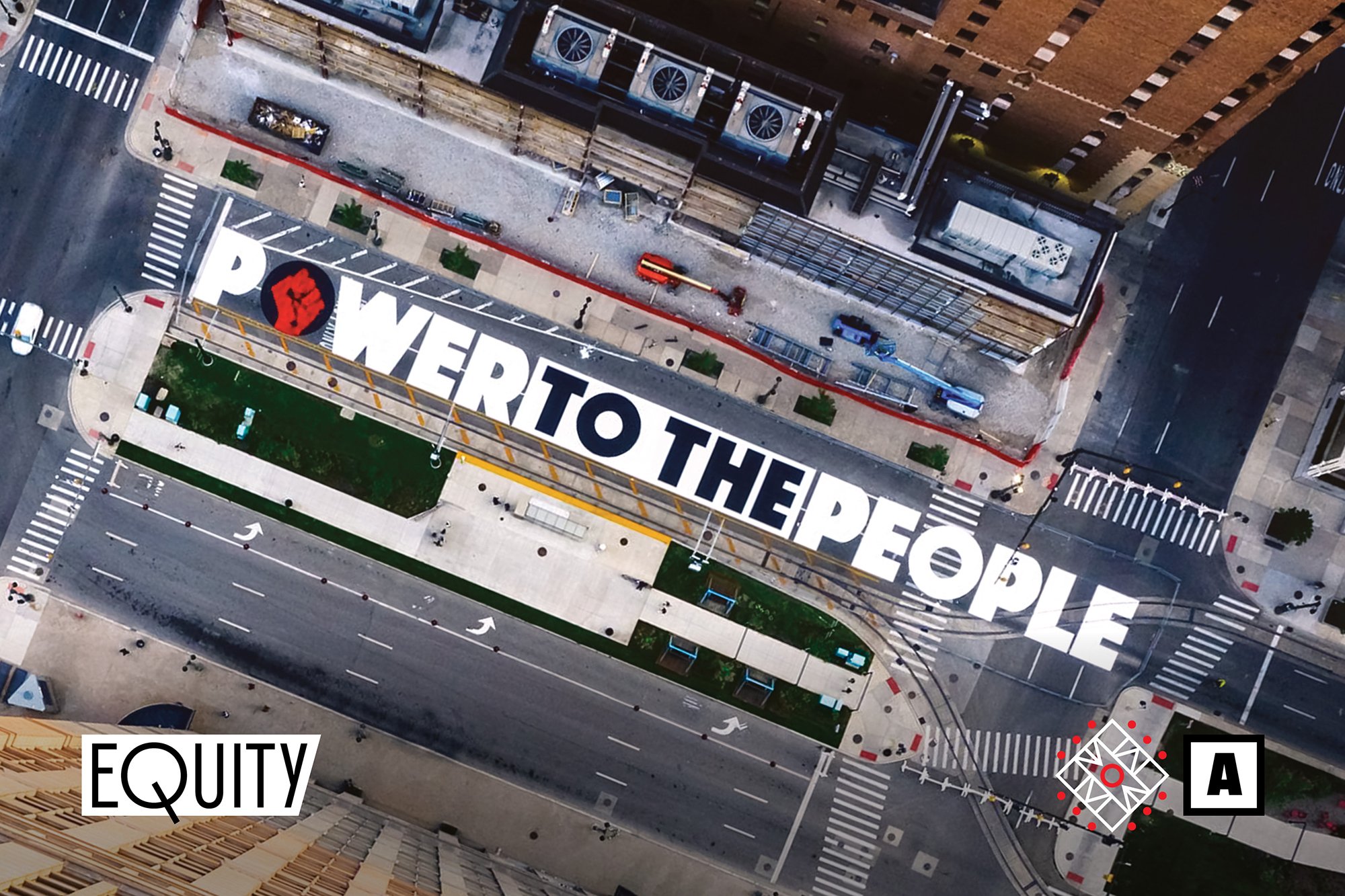
ARCHITECT Magazine is the leading authority on the future of architecture and design, as well as the official journal of the American Institute of Architects (AIA) and the National Organization of Minority Architects (NOMA). ¶ For the October 2021 issue of ARCHITECT, “The Equity Issue,” we designed a bespoke headline typeface inspired by remnants of NOMA’s archives and their goals for the future. 


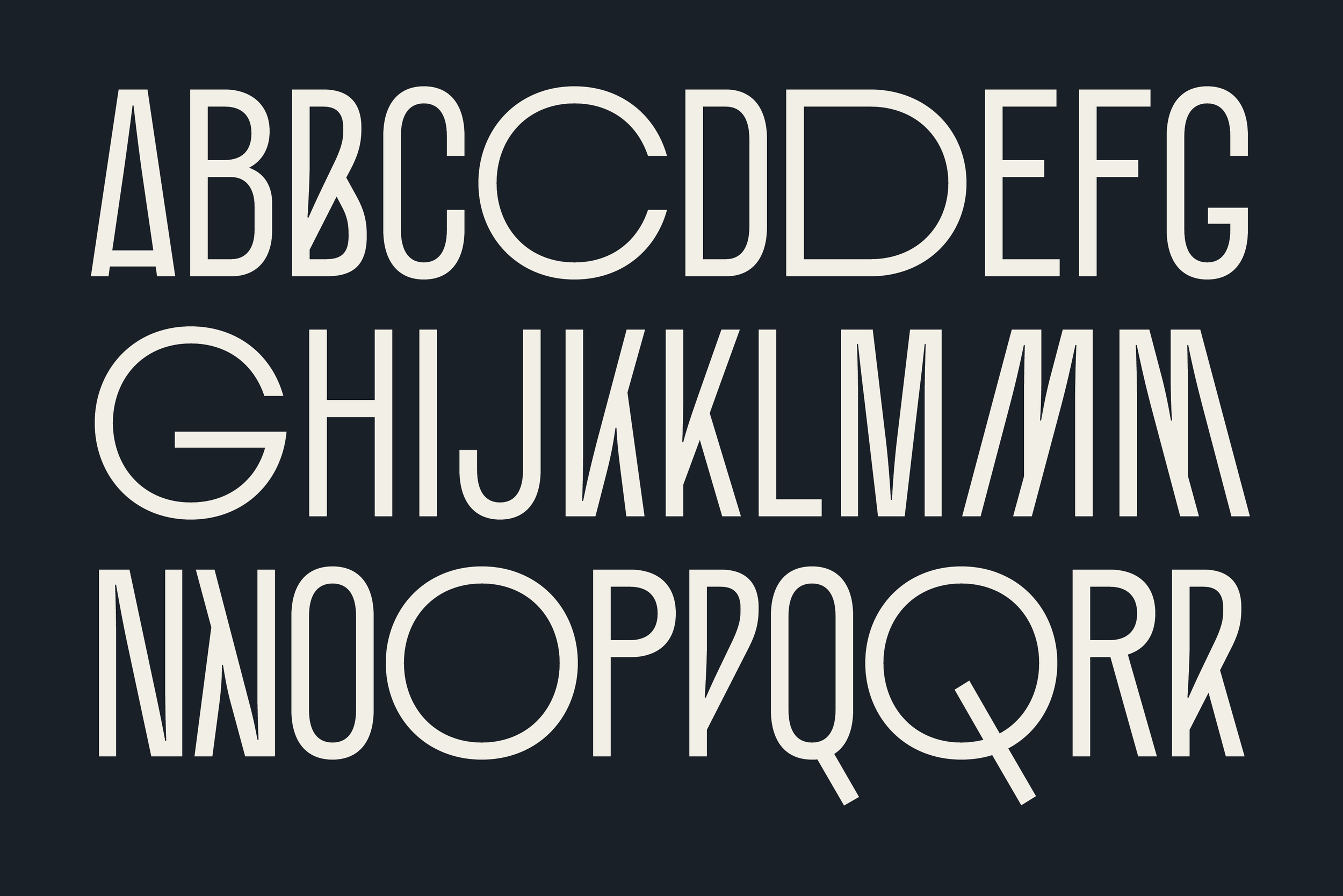
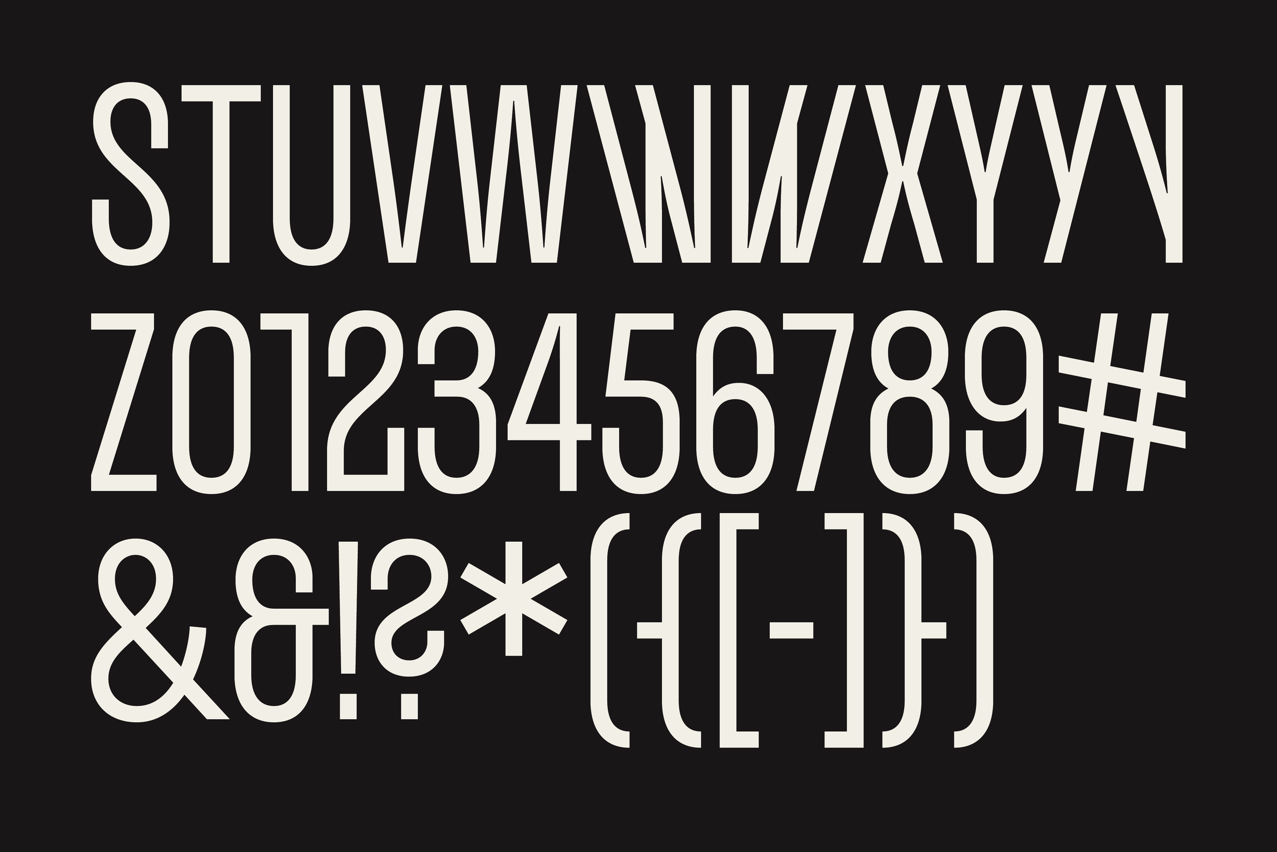
Since NOMA’s founding in 1971, finding remnants of those early days proved quite difficult. However, thanks to the National Museum of African American History & Culture, we found a draft of the program for the organization’s second annual conference, set in the handwriting of Wendell Jerome Campbell. ¶ Wendell Jerome Campbell graduated from the Illinois Institute of Technology in 1957 with a B.A. in Architecture and City Planning. Campbell was instrumental in diversifying the canvas of professionals practicing architecture in the United States. ¶ These unique characters are used as alternates within the font. 


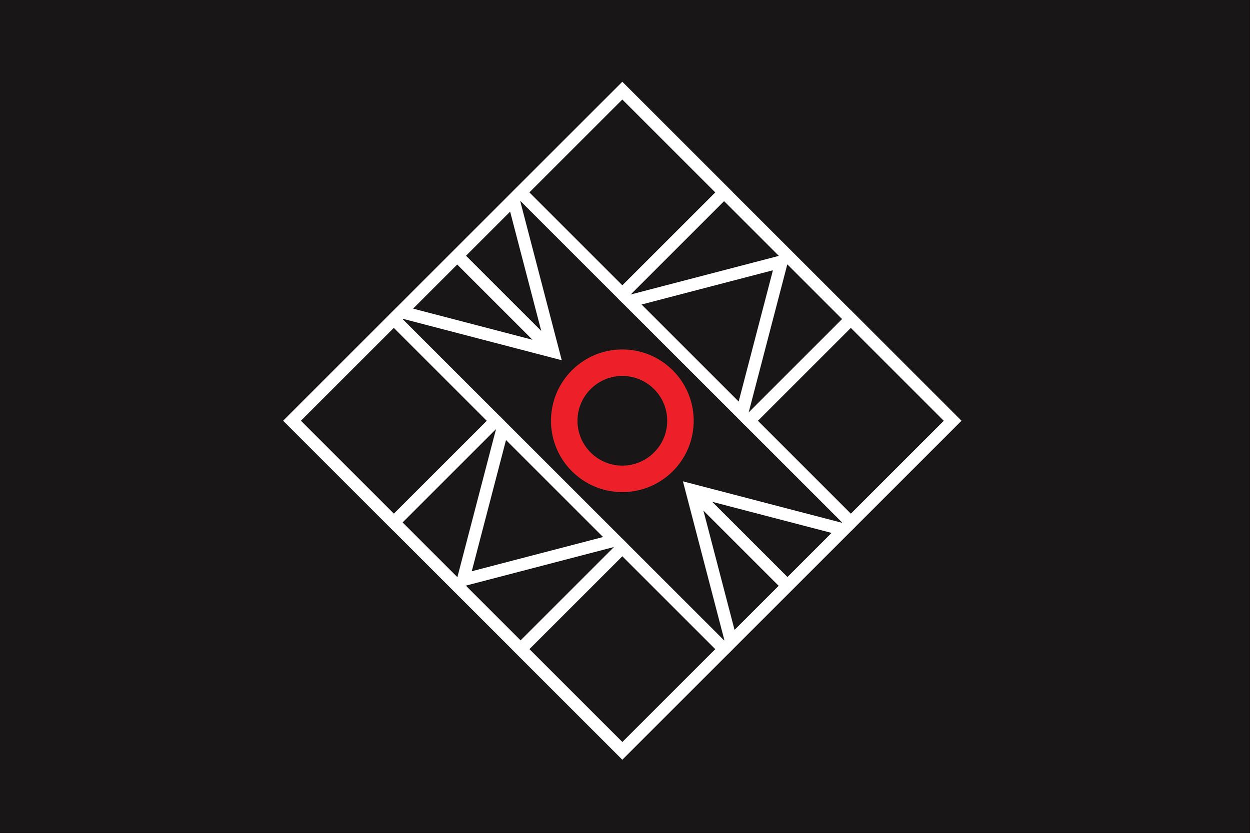
The alternate round characters stem from NOMA’s current abstract monogram.

Once the design team at ARCHITECT Magazine received the font files, they immediately fell in love with it. Naturally, the handwriting-inspired alternates were an instant favorite as you’ll see from some of the spreads in “The Equity Issue.”