
In (an ongoing) partnership with my good friend Michele Patanè, we bring you VTC Garibaldi. This family is inspired by the prolific typographic production of anti-fascist material distributed during WWII: flyers, journals, posters, etc. Works made in clandestinity to avoid the heavy repercussions people could face if found out.
The print work is utilitarian and informal, using what was available. Letterpress, typewriters, cyclostyle machines. The typography is eclectic: we can recognize classic typefaces from the Nebiolo type-foundry, imported typefaces from Germany, wooden type used for headlines or mastheads, monospaced types, and occasionally some decorative faces. There was no time, resources and often the typographical skills to create elaborate designs. The production of was an ephemeral material was limited to a couple of hundred flyers or less to be distributed locally. In cases like the journal ‘Il Combattente’ (The Combatant), published between December 7, 1943 (No. 1) and July 25, 1944 (No. 11), the project is more accomplished and elaborated. It was in fact the journal of the ‘Brigate Garibaldi’, one of the biggest and better organized groups of the Resistance.
The type family has been conceived as a combination of different styles that work together, giving life to a typographic palette where differences and analogies across the family are the elements that define its own nature. The overall palette will offer a modernized toolkit of what could have been available to the printers of the Resistance during the fight for liberation from the Fascist regime that ruled Italy.
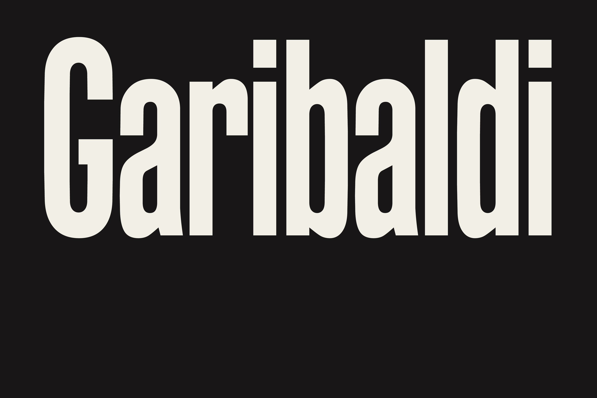
In the overall production, we can synthesize a few recurrent themes into a typographic palette made of a Sans, a Monospace, and a Serif type.The first piece of this puzzle is made of a Sans typeface, beginning with the Extra Condensed type that we find in use for big headlines across a variety of materials. Among these, some of the most significant examples can be found in the the masthead of ‘Il Combattente’.The nature of the letterforms here is quite structured, mechanical, and showing the flavour of wooden type production. We extended the range of weights available at the time trying to preserve that same feeling of utilitarian, sturdy letterforms.


For this version of VTC Garibaldi, we wanted to focus on the usage of big headlines made in a condensed sans grotesque with different degrees of contrast. The nature of the letterforms here is quite structured, mechanic, and related to wooden type production. This type is used across a variety of materials. One of the most significant examples is the masthead of Il Combattente (The Combatant), a journal published between 1943 and 1945.


VTC Garibaldi Sans Extended in the works…

Images sourced by Michele
The name for VTC Garibaldi comes from the Brigate Garibaldi. The Garibaldi Brigades were partisan units aligned with the Italian Communist Party active in the armed resistance against both German and Italian fascist forces during World War II (unlike some of the other partisan units). The Garibaldi Brigades were mostly made up of communists and made up 41% of the partisan units.
The Garibaldini were distinguished by the political symbols of their uniforms: red handkerchiefs around the neck, red stars on hats, emblems with hammer and sickle. **

Garibaldini at the castle of Pavia, 25 April 1945. Archivio Privato Jonio Salerno
Eventually, we hope to release VTC Garibaldi Serif, VTC Garibaldi Mono, and a few more families. But for now, here’s VTC Garibaldi Sans Extra Condensed.